Every wedding suite we design is tailored to your vision. From paper texture to typography, every element can be customized to reflect your aesthetic and event style. Whether you prefer timeless and romantic or modern and minimal, our customization options allow you to create a cohesive, personal stationery suite that feels uniquely yours.
Paper Options
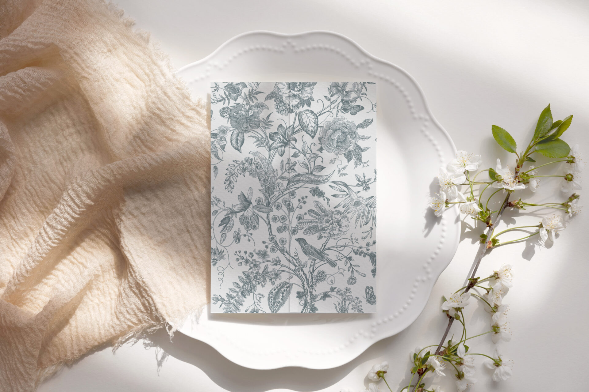
The foundation of every invitation is its paper. We offer a curated selection of premium stocks, each chosen for its texture, tone, and print quality (*** some options are upgraded options and may require an additional fee)

Smooth matte 
Linen textured 
Felt textured 
Cold white shimmer 
Warm white shimmer 
Shimmery linen 
Cotton *** 
Cotton felt *** 
Shimmery gold ***
Font & Typography
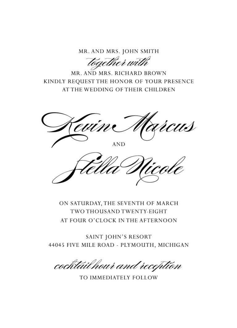
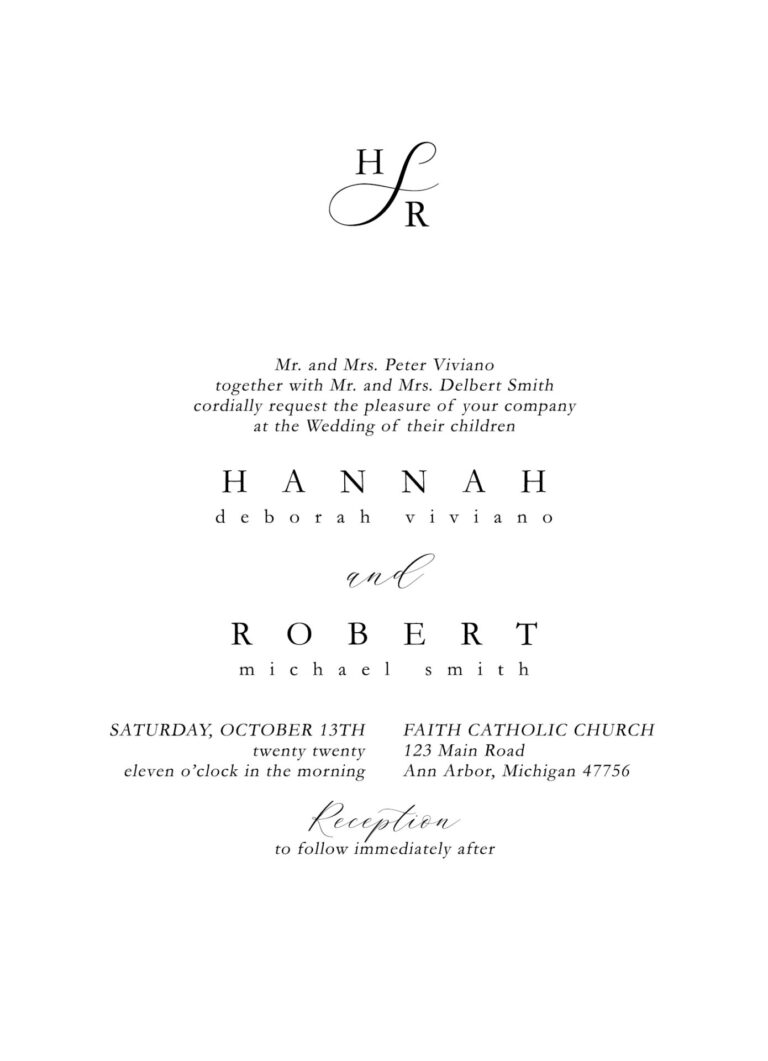
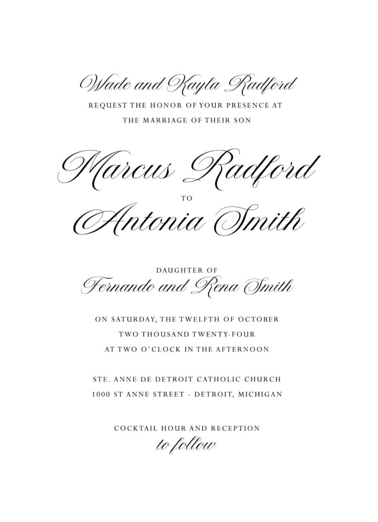
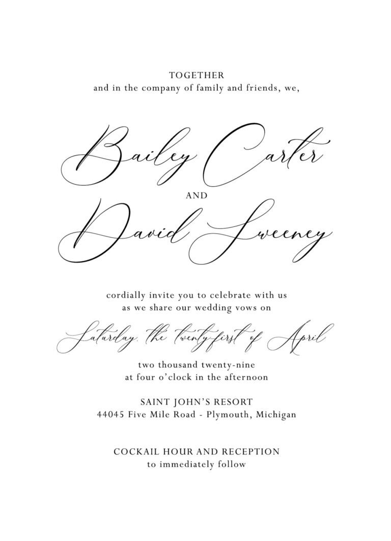
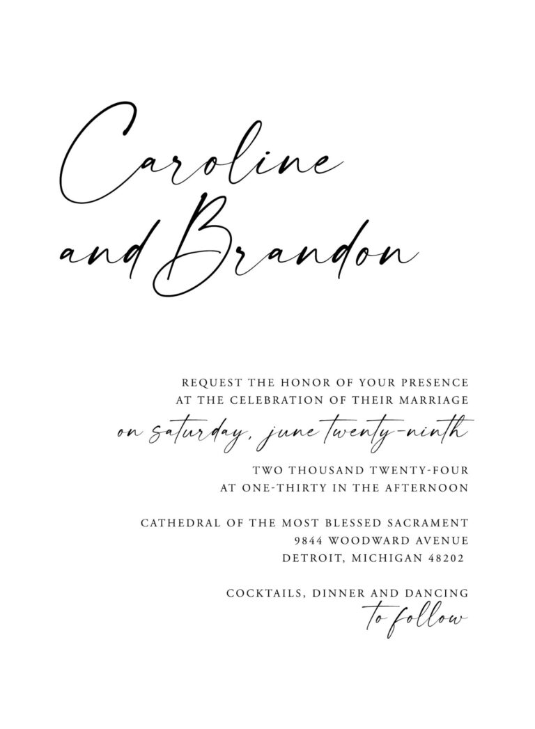
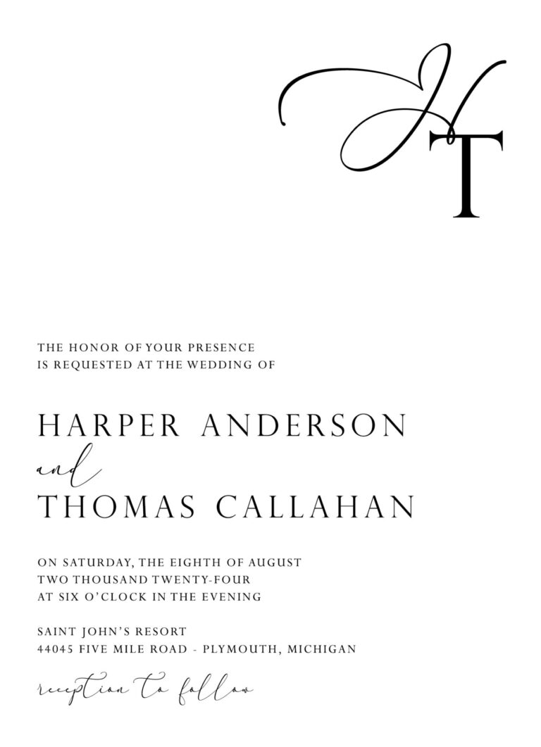
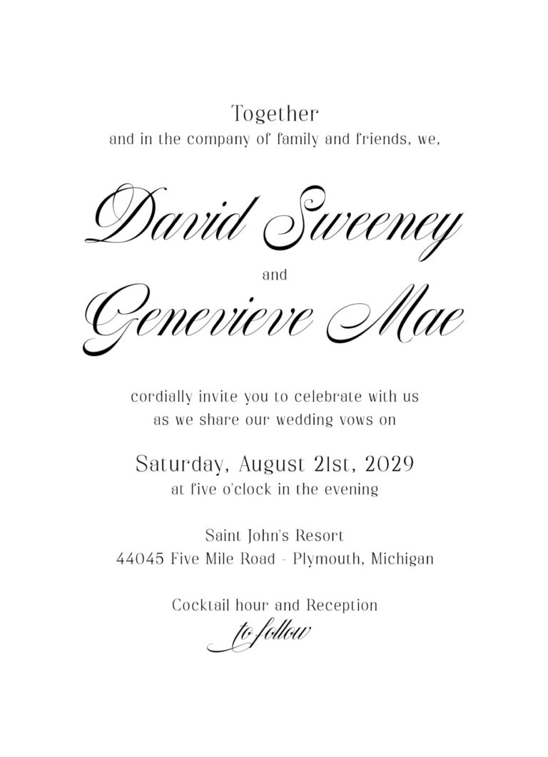
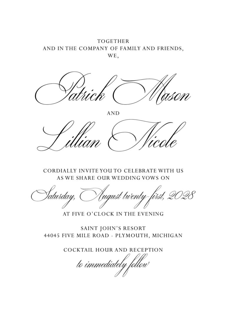
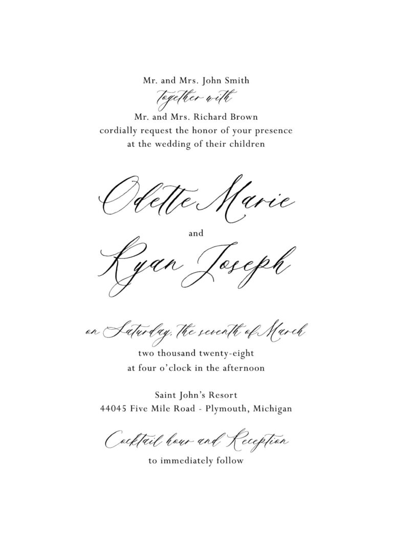
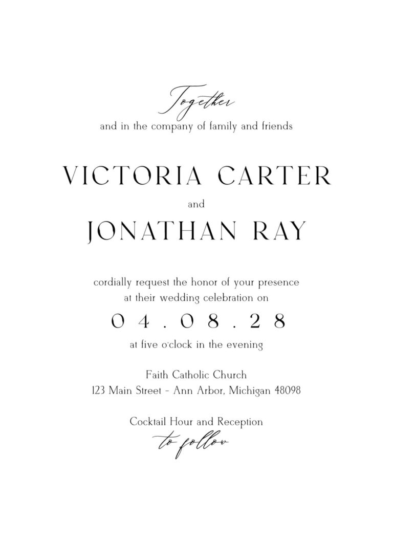
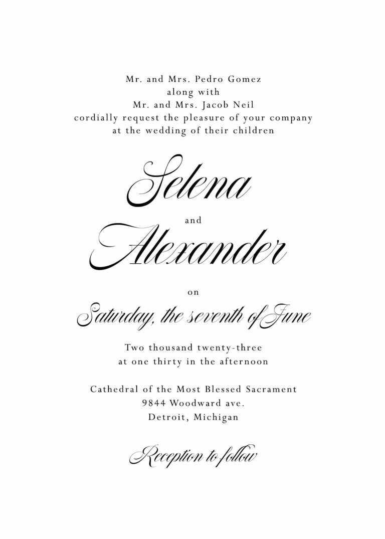
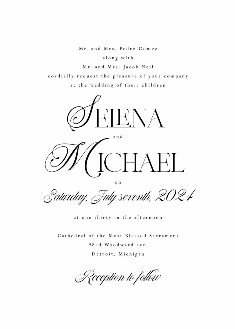
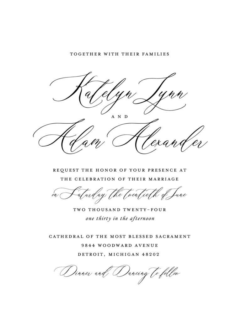
Typography plays an essential role in the overall feel of your stationery — it can completely transform the mood of a design. Rather than showing a list of individual fonts, we’ve created a series of sample layouts to help you see fonts in context and understand how each style influences the tone of your suite.
From refined serifs to modern scripts and clean sans serifs, these examples illustrate how font choices can shift a design from classic to contemporary, romantic to minimal, or anything in between. Each font pairing can be customized or mixed to create a look that feels uniquely yours. You’ll see typography examples in real layouts rather than isolated font lists, allowing you to understand how scale, spacing, and hierarchy work together.


font color
Our font colors were hand picked for beauty and readability. Each shade is slightly desaturated to feel refined, and deep enough to print crisp body text on light stocks. These hues coordinate with our envelope palette while keeping strong contrast, so your wording stays clear in any layout.
- Soft Charcoal
- Moonstone Slate
- Amethyst Smoke
- Burgundy Fig
- Desert Clay
- Terracotta Kiss
- Rose Nude Tint
- Apricot Veil
- Honeyed Oat
- Dove Velvet
- Olive Drabette
- Sage Ribbon
- Eucalyptus Tea
- Cedar Forest
- Nocturne Green
- Deep Teal
- Lakehouse Blue
- Dusty Sky
- Bluebell Slate
- Truffle Taupe
accents color
Accent colors are softer tints chosen to add romance without overwhelming the design. They echo the envelope palette and pair with the core inks, and they work best for names, monograms, borders, and small motifs. Use them to introduce depth and cohesion while the main text remains perfectly legible.
- Porcelain Mist
- Champagne Pearl
- Petal Blush
- Mauve Veil
- Sea-Glass Blue
- Sage Haze
- Latte Mousse
- Pale Citrine
- French Gray
- Silver Mist
- Wedding White
- Wedding Cream
- Cool Grey
- Pale Grey
- Chardonnay
- Timberwolf
- Powder Pink
- Cipria
- Lilac
- Cool Blue
- Eucalyptus
- Stone
- Rose Nude
- Terracotta
- Spice Nude
- Steel Blue
- Mid Green
- Forest Green
- Burgundy
- Amethyst
- Navy Blue
- Dark Teal
- Racing Green
- Ebony
- Crystal Shimmer
- Opal Shimmer
- Coral Shimmer
- Sand Shimmer
- Silver Shimmer
- Gold Shimmer
envelopes colors
Our envelope palette is a thoughtfully curated set we can produce quickly and consistently, chosen to coordinate beautifully with our core inks and accents. We can source or custom-curate other hues on request, pending availability and lead time. Shimmer shades have a soft pearlescent finish in person, while on-screen swatches are shown as gentle gradients. Because screens and lighting vary, color on a monitor may differ from the real paper, so please treat these swatches as a guide and order a sample pack if an exact match is important.
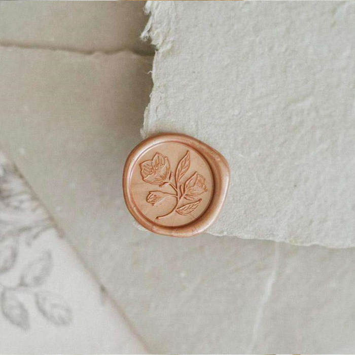
finishing touches
Finishing touches are optional enhancements available for our Essentials collection. These elements allow you to elevate your stationery while maintaining a flexible, ready-to-order experience.
Each option below is offered unassembled, giving you the freedom to incorporate these details at your own pace or with the help of a planner or loved one.