One Design, Two Directions: How the Same Invitation Layout Can Become Something Completely Different
When you’re looking through wedding invitations, it’s easy to assume that what you see is what you get. You find something you like, and then try to find a version that feels close enough.
In reality, most designs are meant to be adjusted.
This example shows how one layout can be customized in a few ways without changing the overall structure.
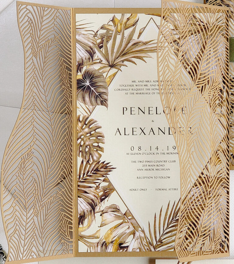
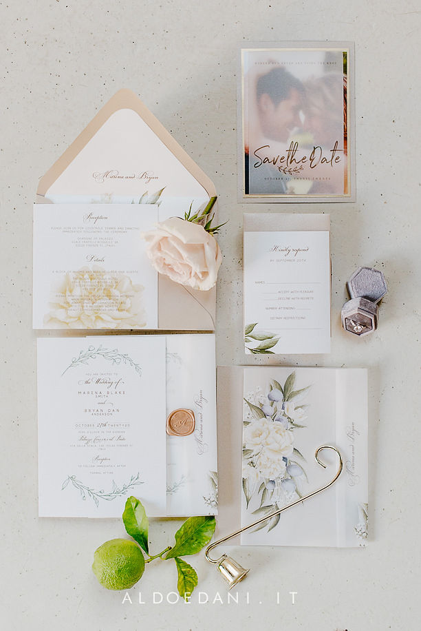
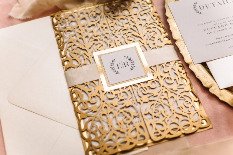
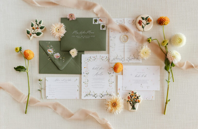
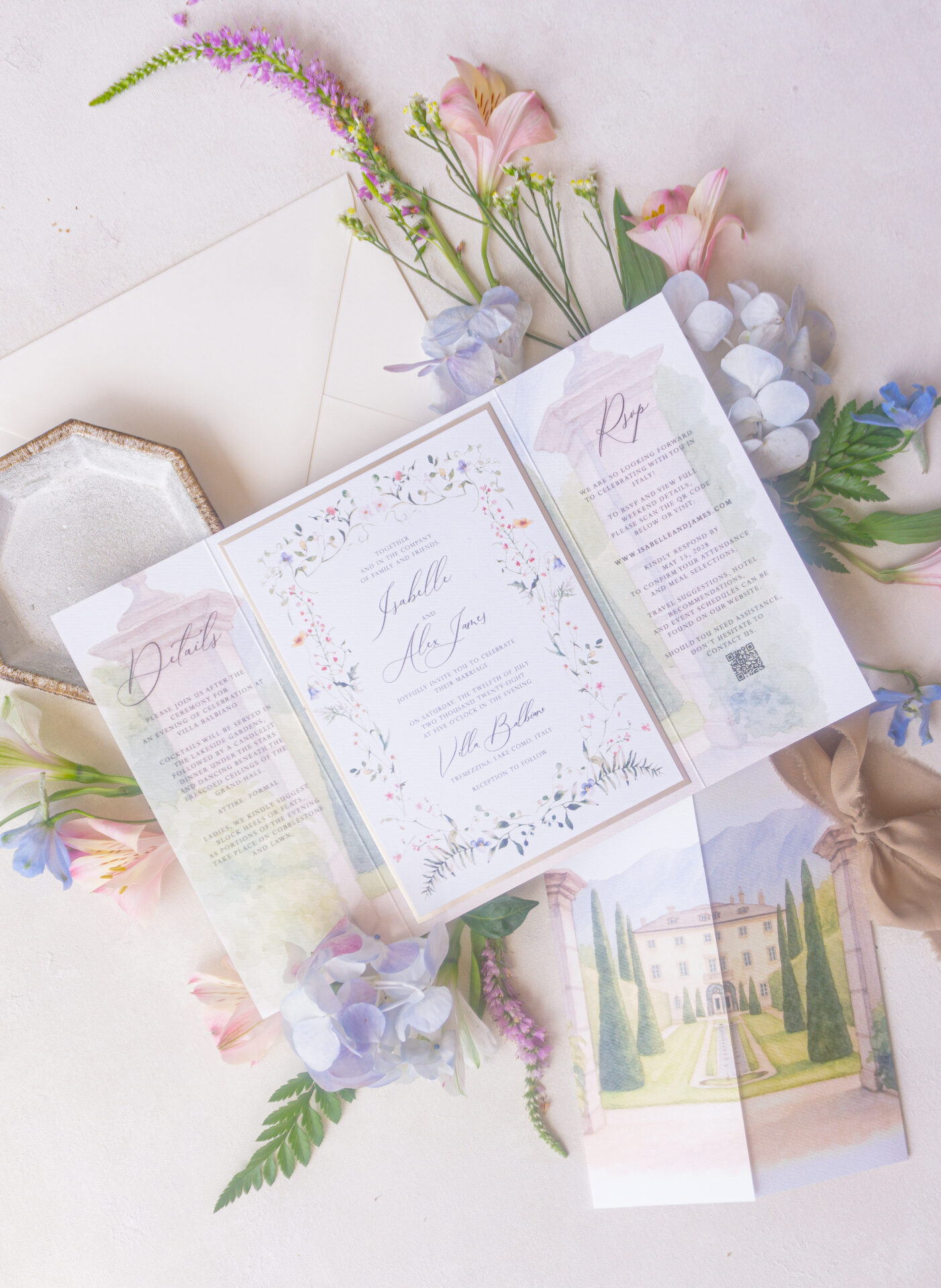
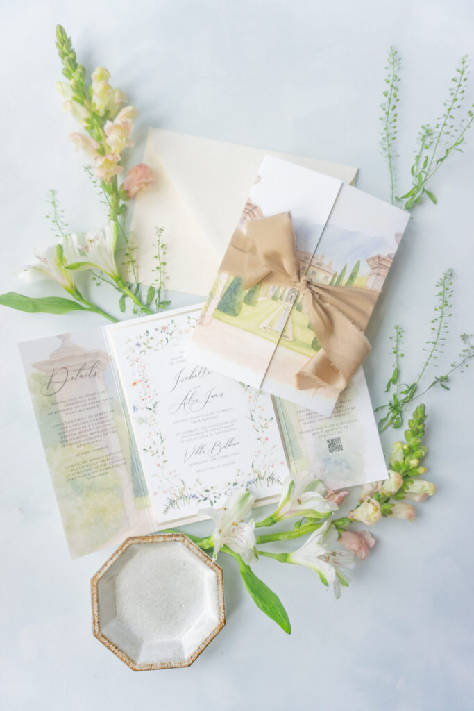
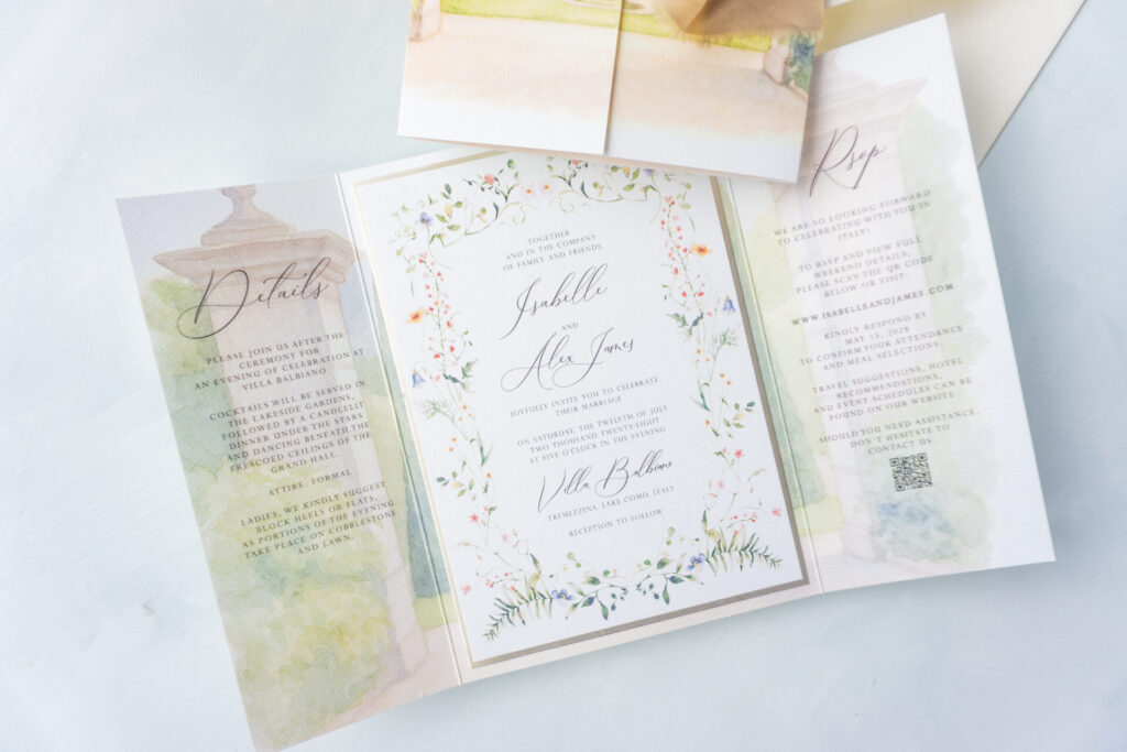
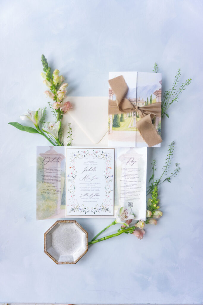
This is the starting point. A venue-focused design with a clean layout and a layered presentation tied together with ribbon. For most couples, this is where they begin. Something about the design feels right, whether it’s the layout, the artwork, or the overall composition.
From there, the changes are usually more specific.
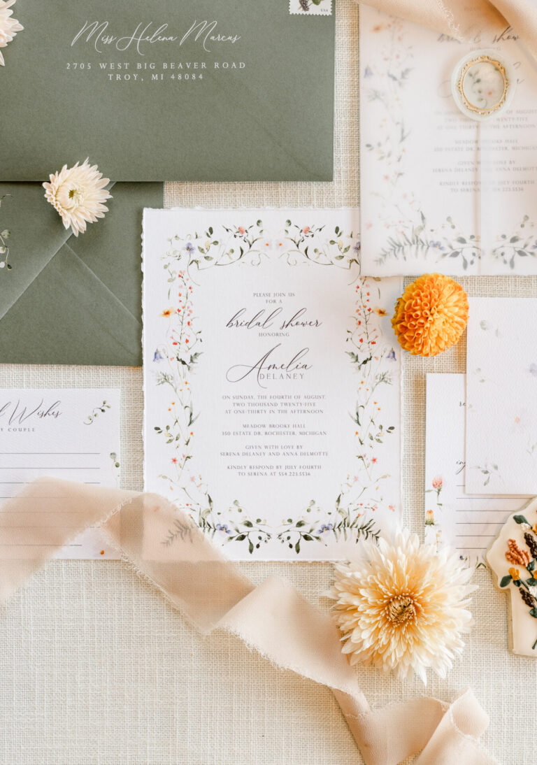
The front is often the first thing to shift. You can keep the layout exactly the same, but swap the venue illustration, move toward something more floral, or adjust the color palette entirely. That alone can make the design feel like it belongs to a completely different wedding.
The inside can change just as easily. Some couples want something more minimal, others prefer to add detail or rebalance how the information is laid out. The structure stays the same, but the way it’s used is different.
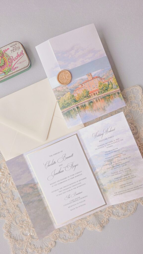
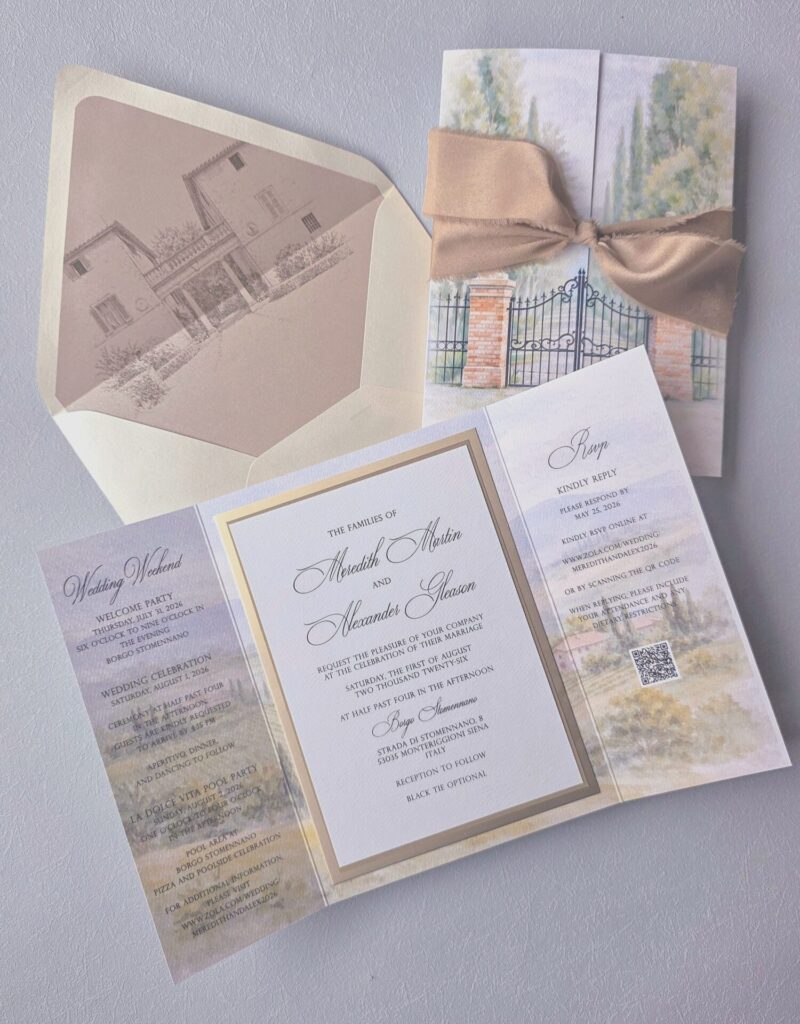
Finishing details make a noticeable difference too. In this case, one version keeps the ribbon, while another replaces it with a wax seal. It’s a small change, but it shifts the feel of the entire suite. Ribbon reads softer and more traditional, while a wax seal feels a bit more refined and structured.
Across all of this, the layout itself doesn’t really change. What changes is how each part of the design is used, from the artwork to the materials to the finishing details.
That’s usually the part people don’t realize at first.
You don’t need to find a design that’s perfect as-is. You just need a starting point that works, and then everything else can be adjusted around it.