Wedding Invitation Layout Ideas: Classic, Modern, and Unique Options for Every Style
Choosing the perfect layout for your wedding invitations sets the tone for your big day and reflects your wedding style. From timeless, classic layouts to bold, modern designs, your wedding invitation layout offers a sneak peek into the experience awaiting your guests. Explore these wedding invitation layout ideas and font pairings to inspire a cohesive, beautiful design.
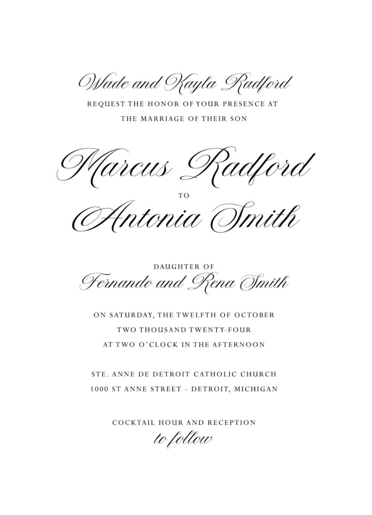
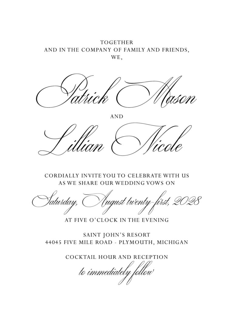
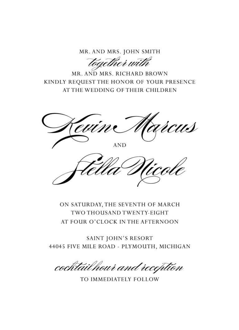
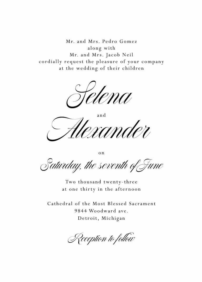
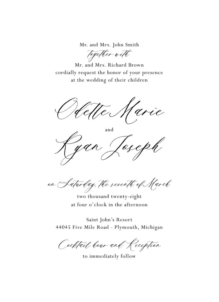
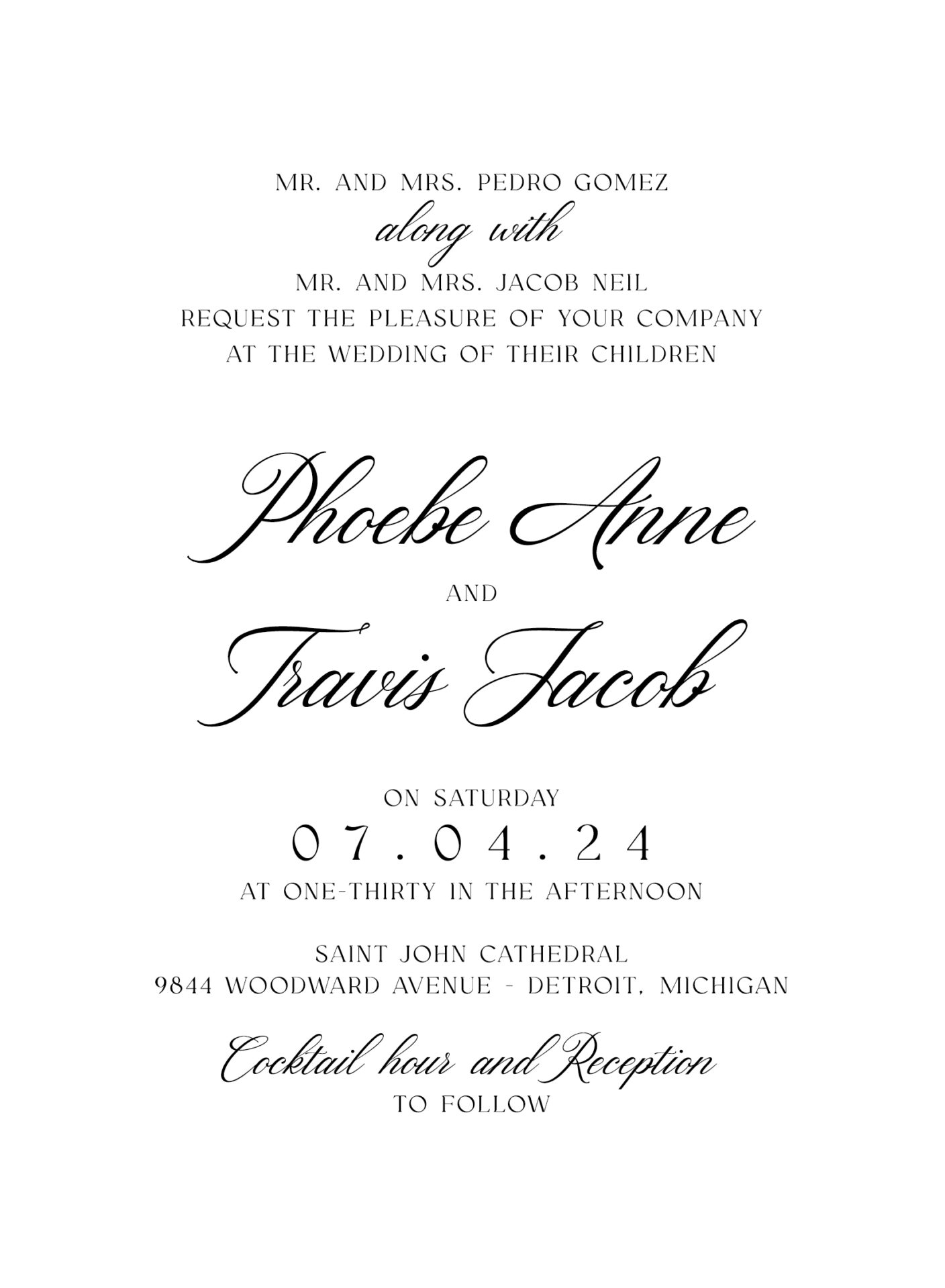
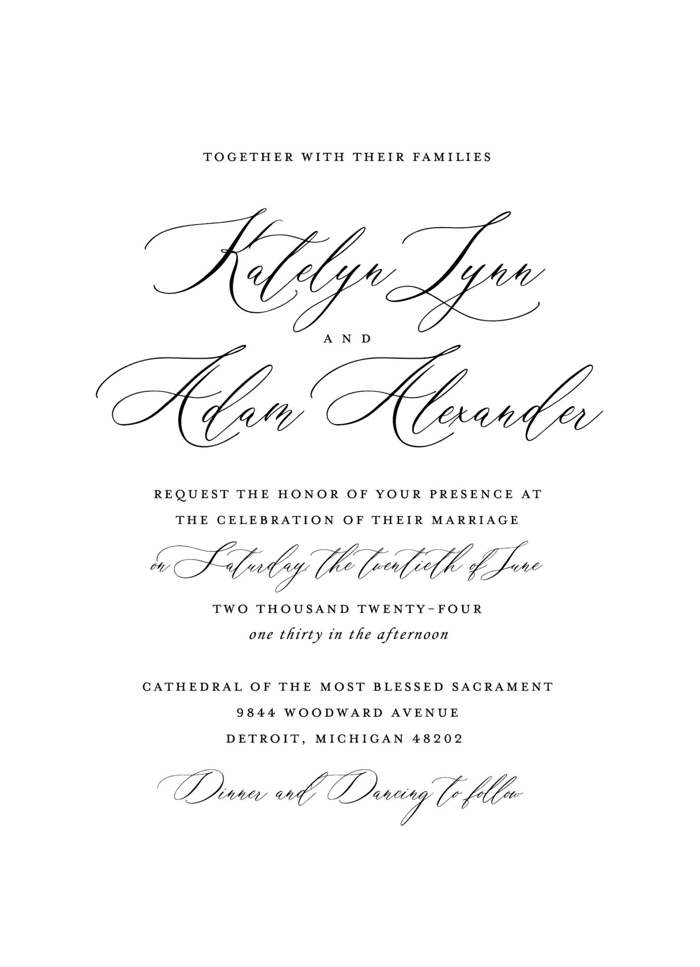
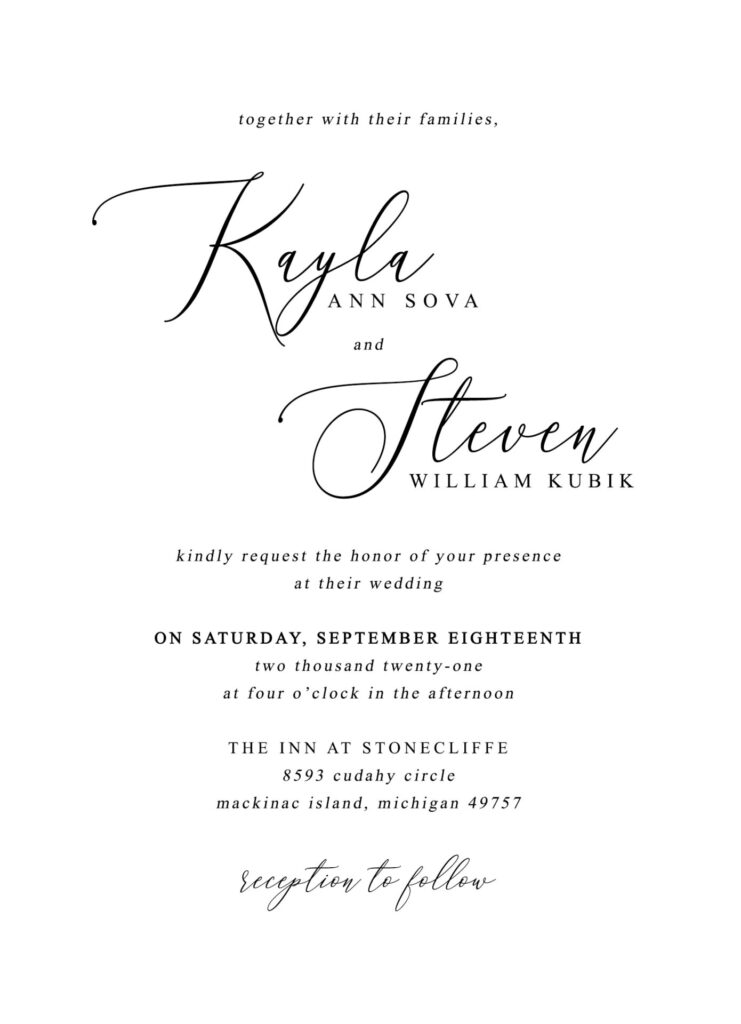
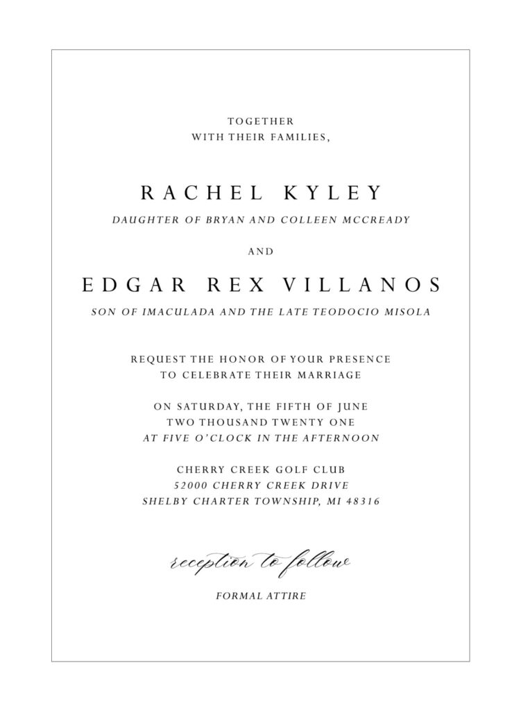
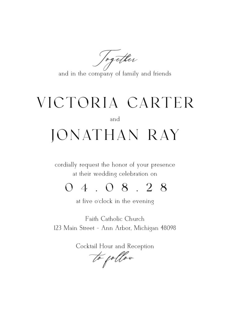
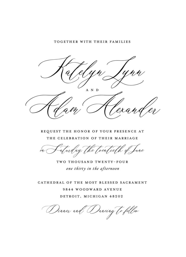
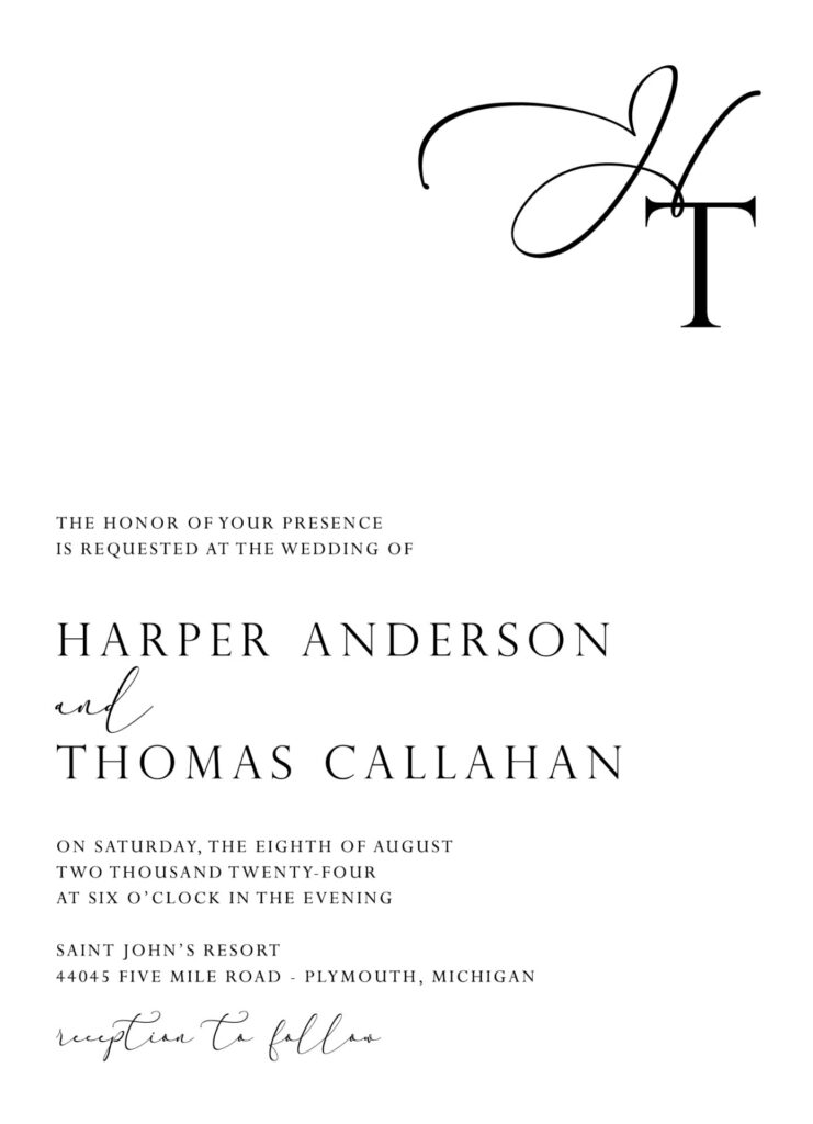
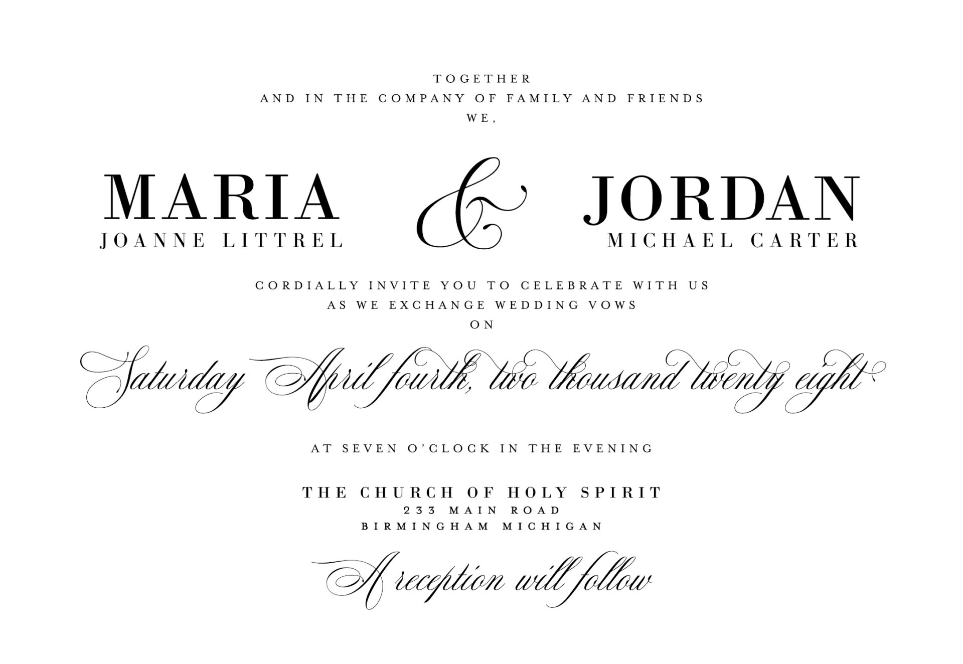
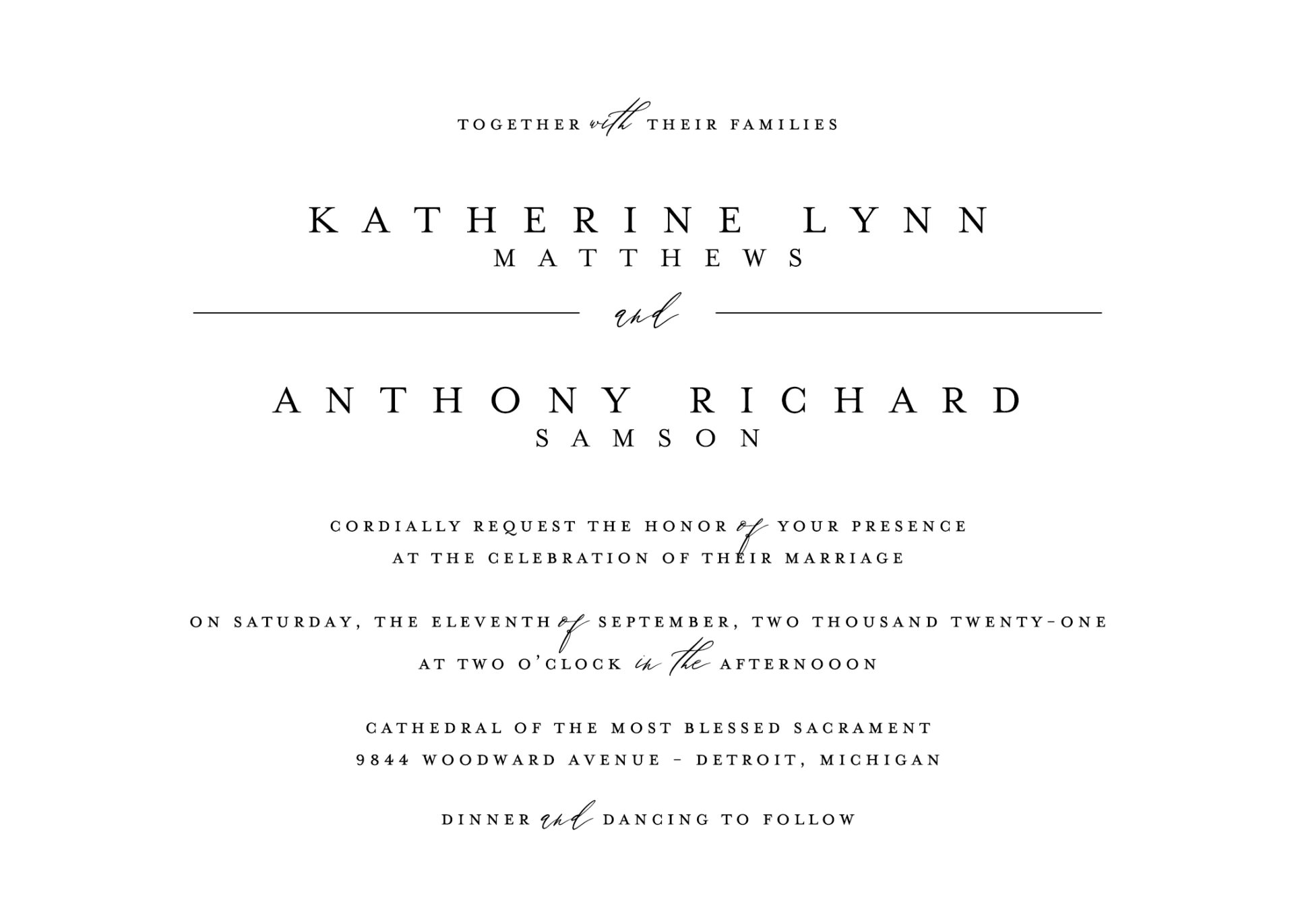
Classic Wedding Invitation Layout with Script and Elegant Modern Fonts
For couples seeking a timeless yet fresh look, this layout combines centered text with a refined mix of script and elegant modern fonts. The names are often highlighted in a soft, flowing script, while the main details use a clean, modern serif or sans-serif font. This approach is perfect for formal or minimalist weddings, offering a sophisticated look that’s classic yet updated.
- Font Pairing: Delicate script for names paired with a refined serif or sans-serif for the event details
- Design Tip: Use soft color palettes or monochrome for a sleek, cohesive look. Adding small line accents or simple borders can enhance the formal feel.
Example Layout:
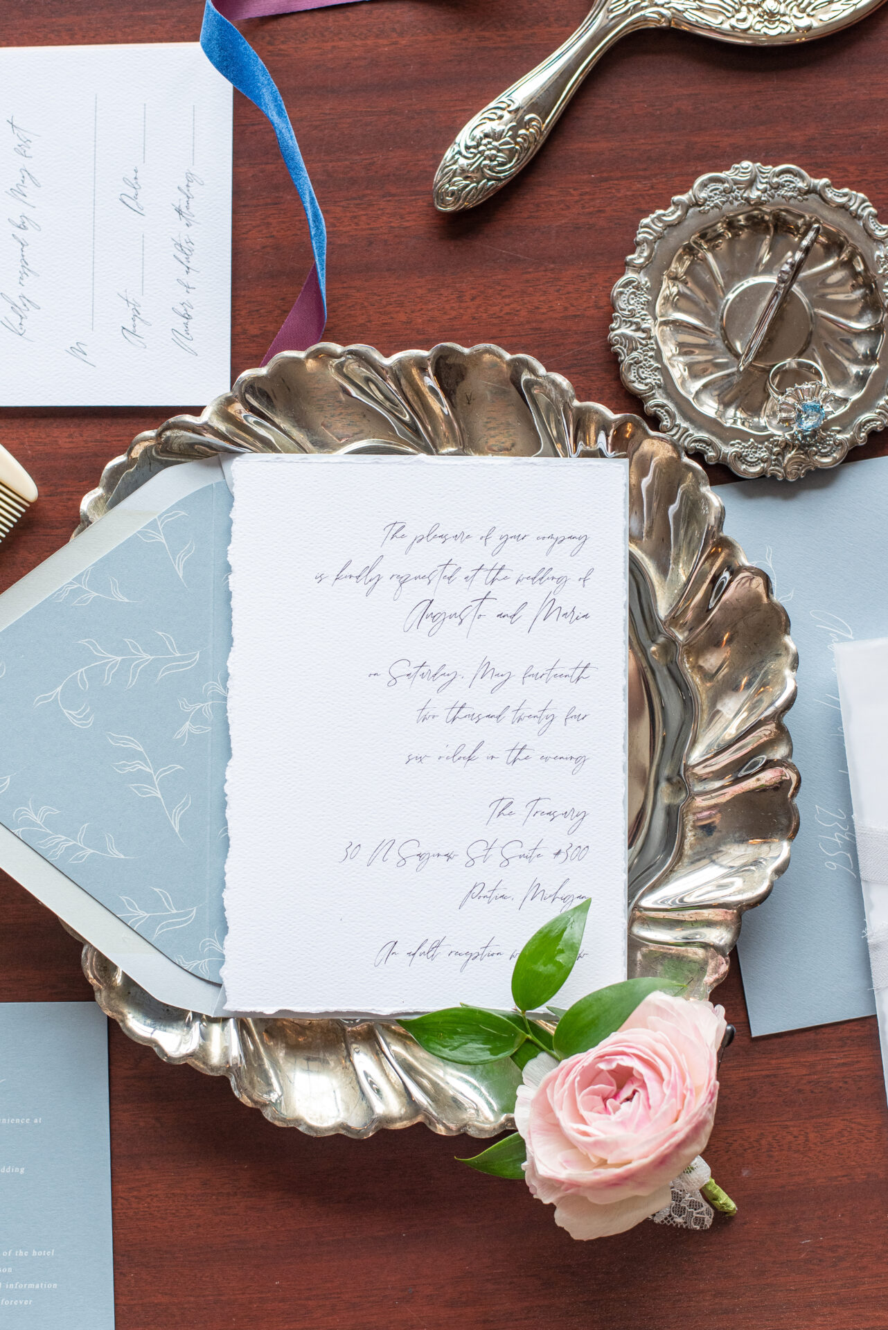
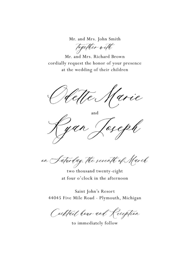
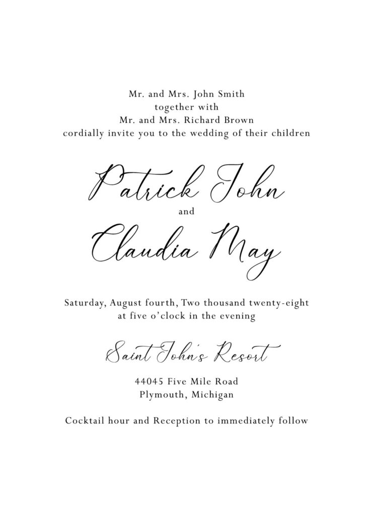
Rustic Whimsy Classic Wedding Invitation Layout
For a more relaxed and whimsical twist on the classic layout, this style combines a centered format with rustic or hand-drawn fonts. Ideal for outdoor, bohemian, or nature-inspired weddings, this layout creates a warm, inviting feel. The font choices often include a playful, hand-lettered script for names and a vintage serif or light handwritten style for details, adding a touch of charm and personality.
- Font Pairing: Hand-drawn or playful script with a rustic serif or casual handwritten font for additional text
- Design Tip: Integrate botanical illustrations or watercolor accents to enhance the rustic vibe, and consider using earthy tones for a cohesive, nature-inspired look.
Example Layout:
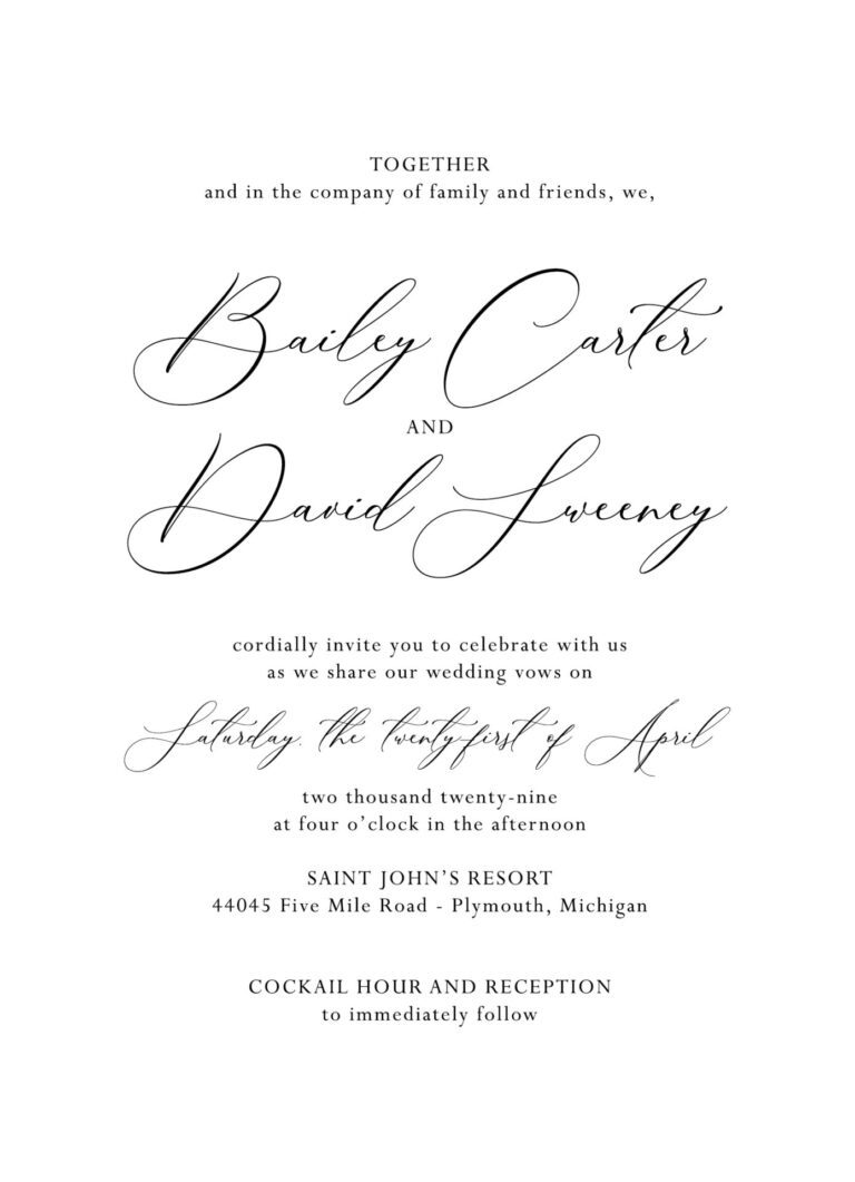
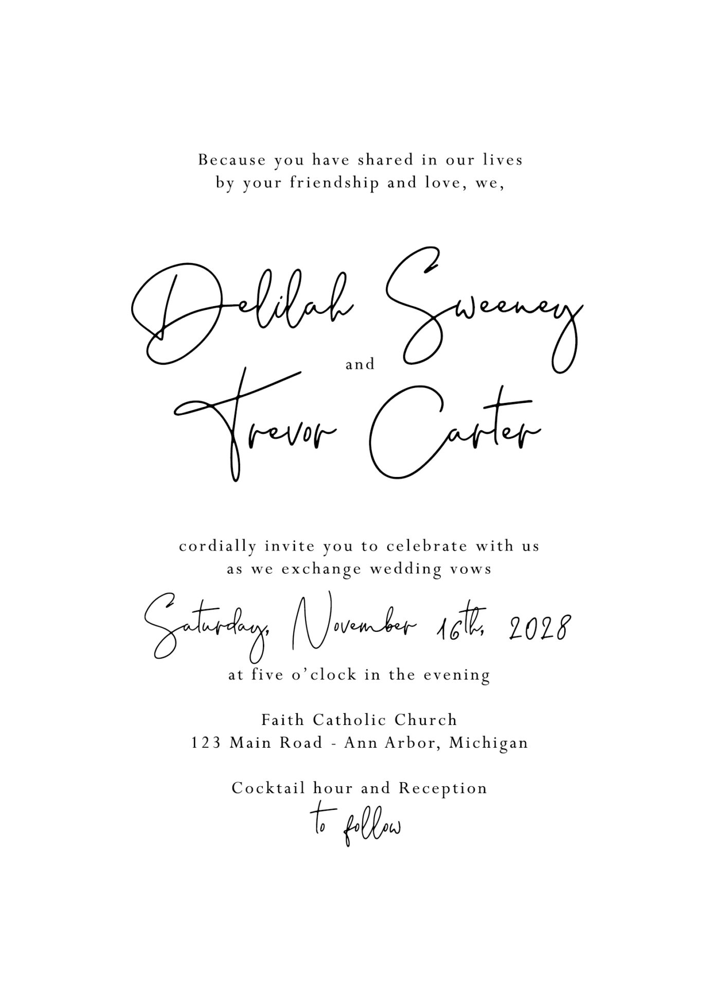
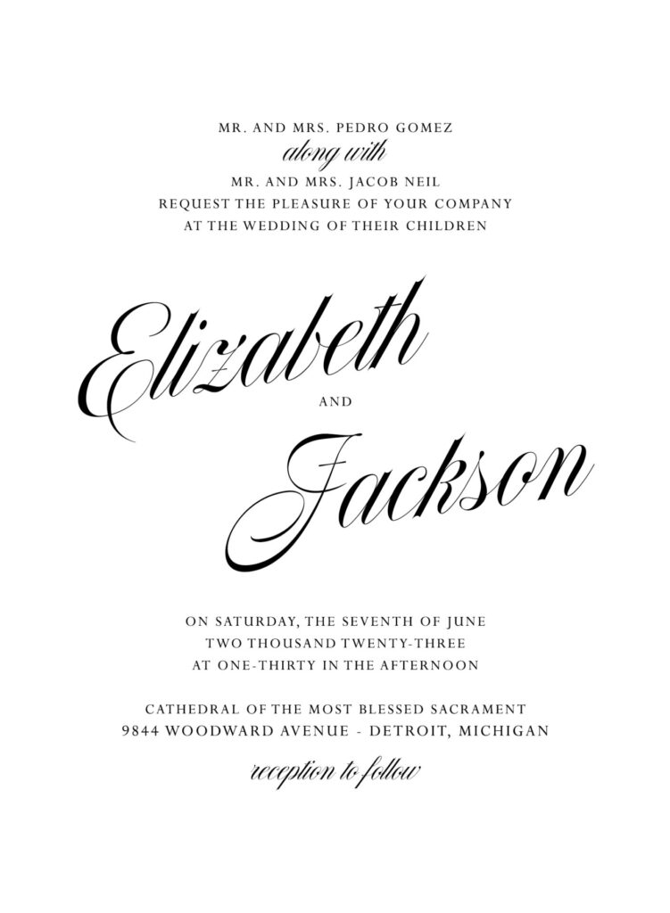
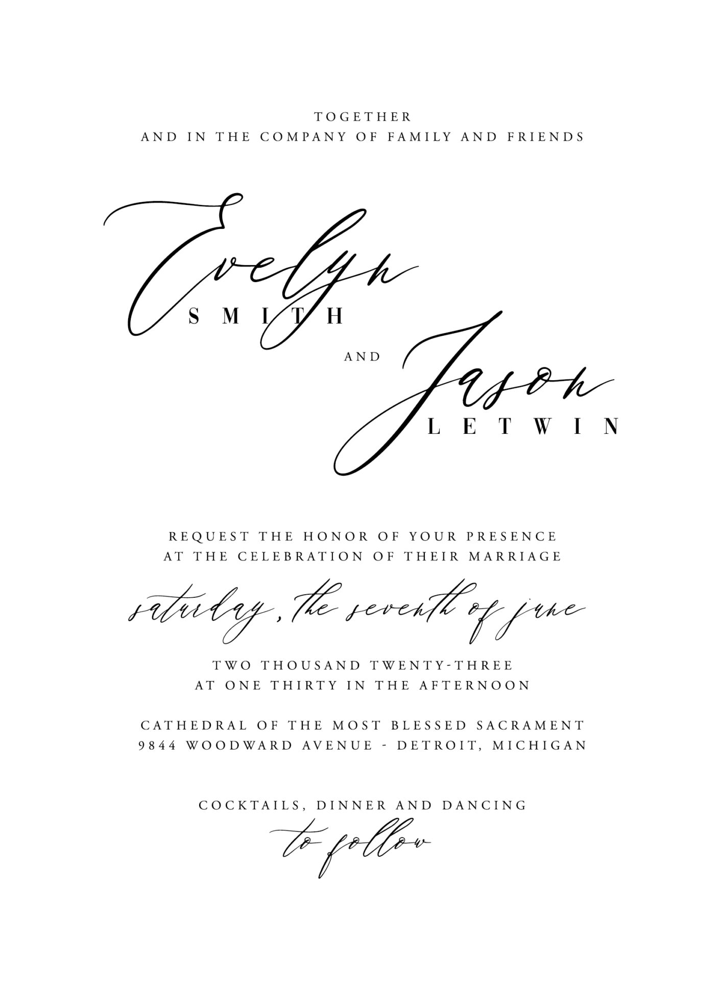
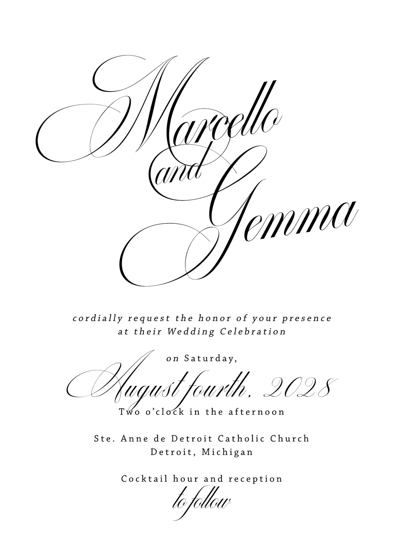
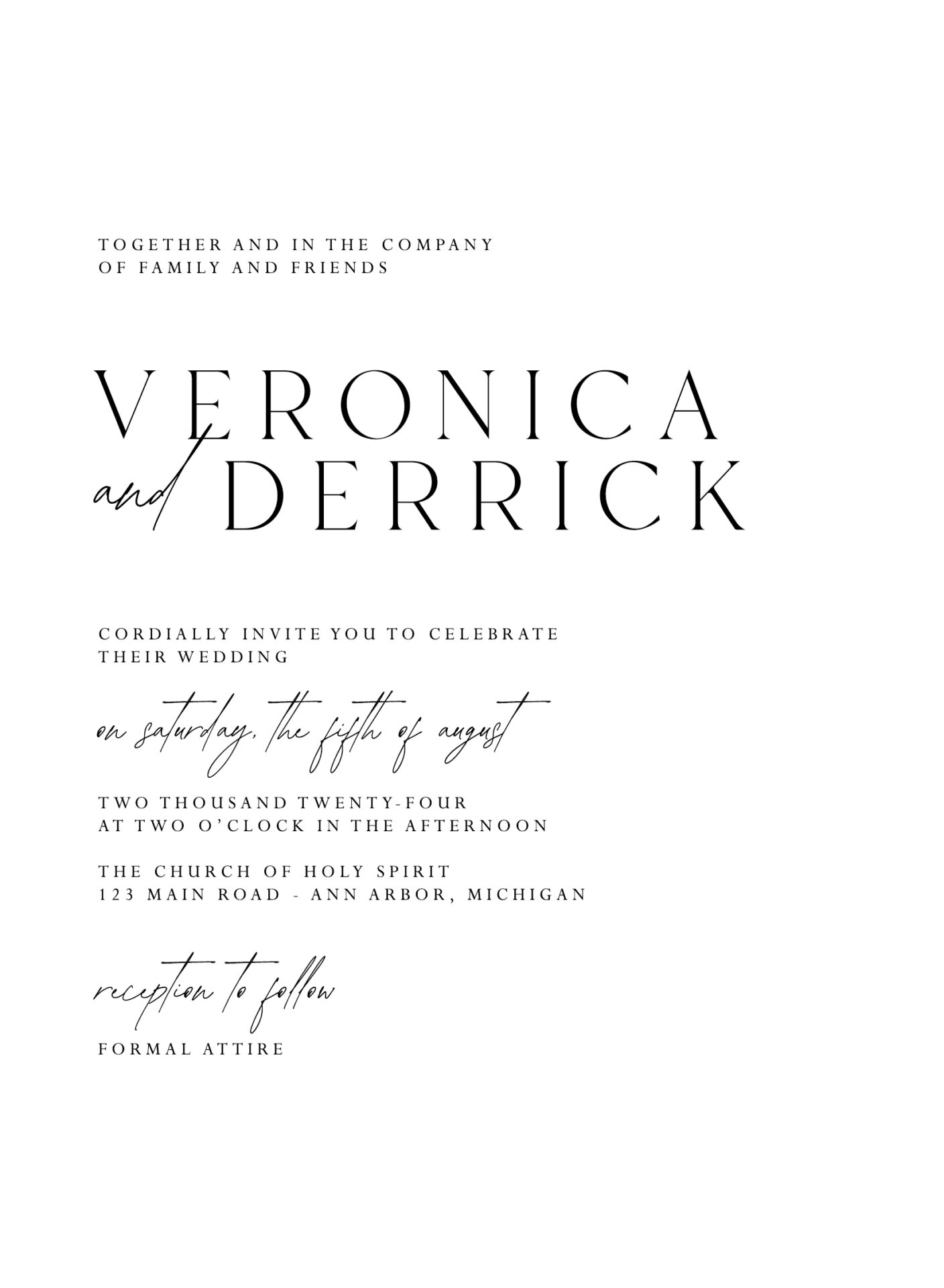
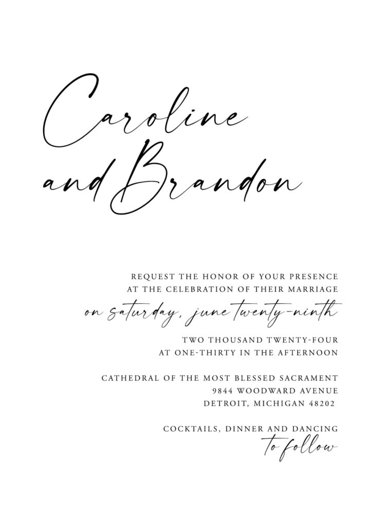
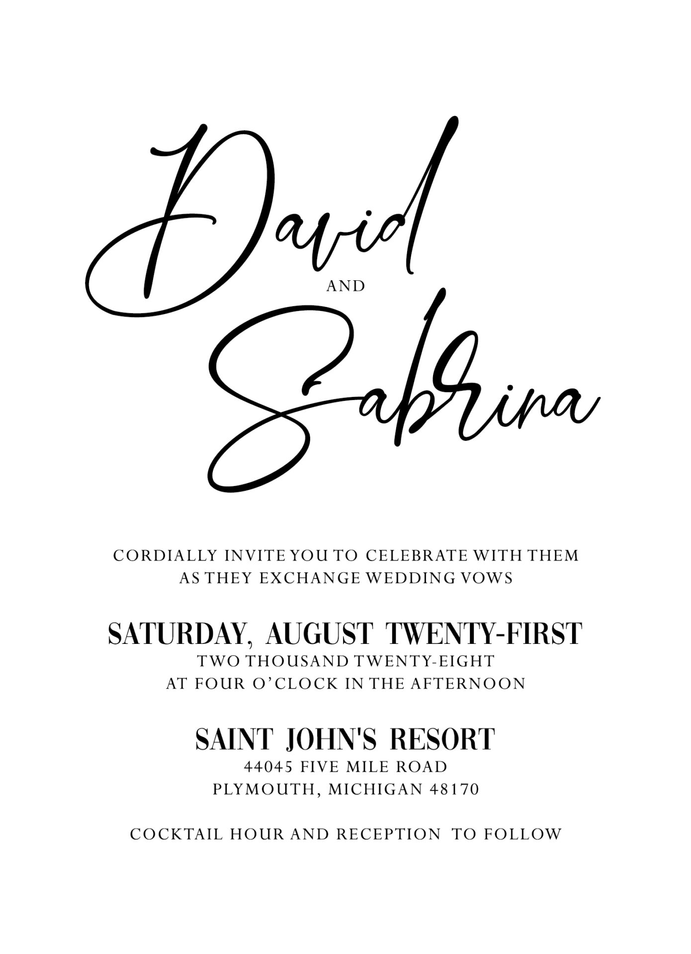
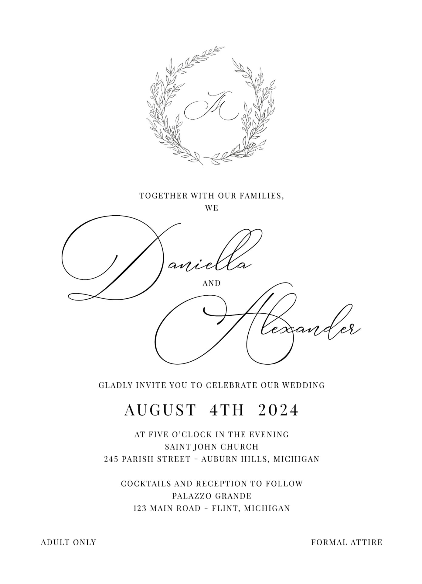
Modern Slanted or Offset Names Layout
For a fresh, contemporary twist, the slanted or offset names layout draws attention to the couple’s names by positioning them at an angle or slightly off-center. This eye-catching design is perfect for modern weddings, bringing a stylish, playful element to the invitation while keeping it elegant and balanced. By using slanted text or offset placement, this layout creates a bold focal point that instantly grabs attention.
- Font Pairing: A modern serif or sans-serif font with clean lines to keep the look sophisticated
- Design Tip: Keep the rest of the text minimal and aligned to maintain balance, letting the angled names be the primary design feature. Subtle color contrasts or gradient effects can also add a unique touch.
Example Layout:
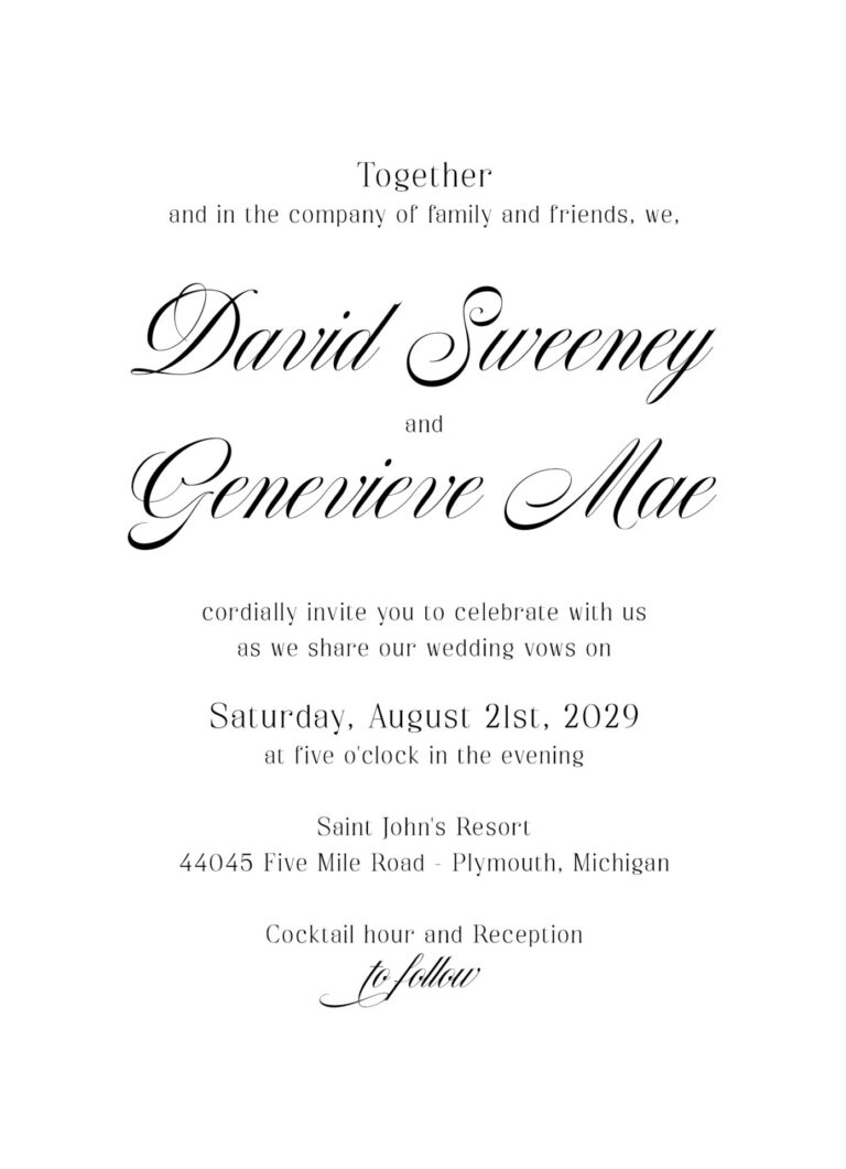
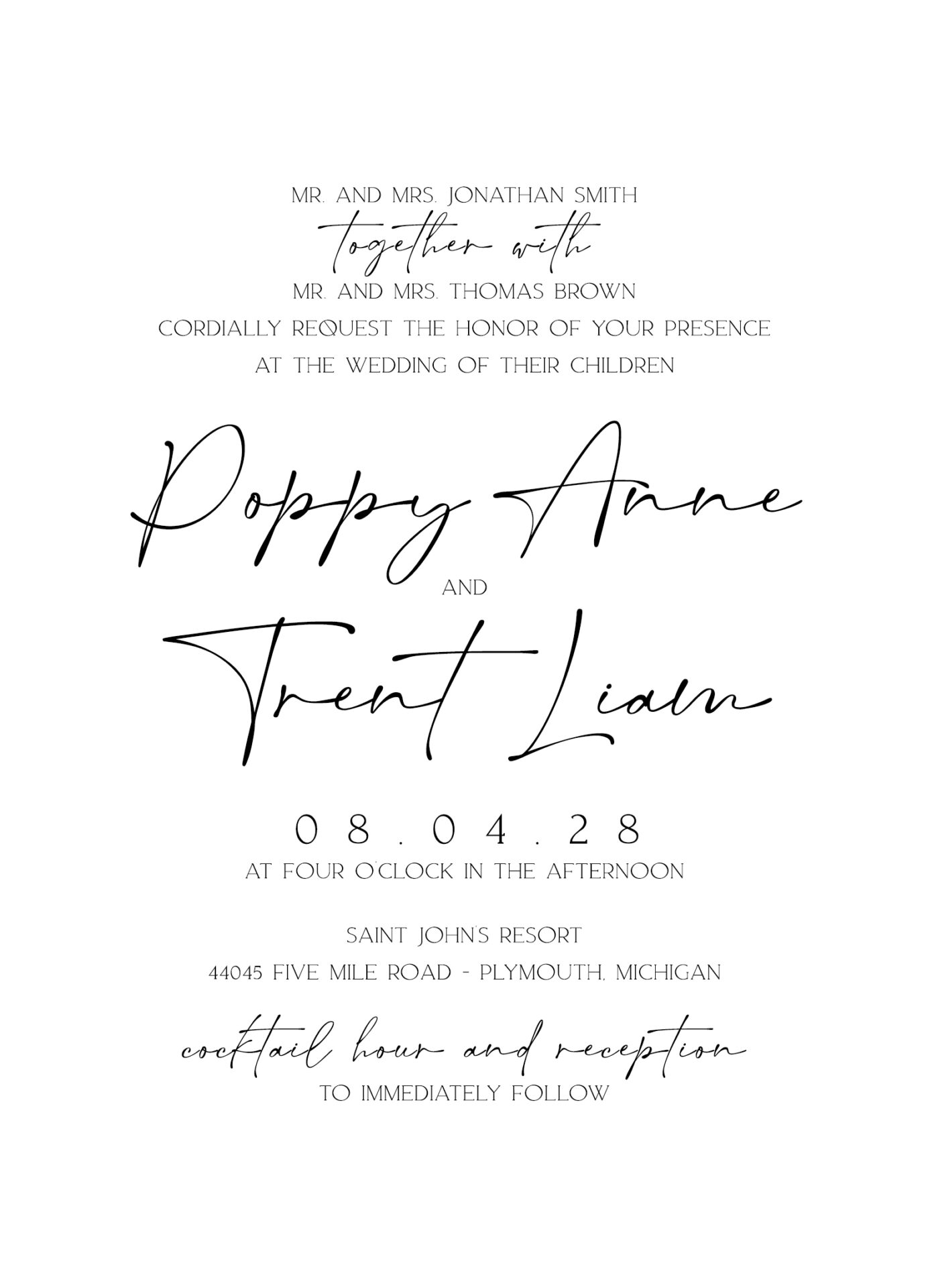
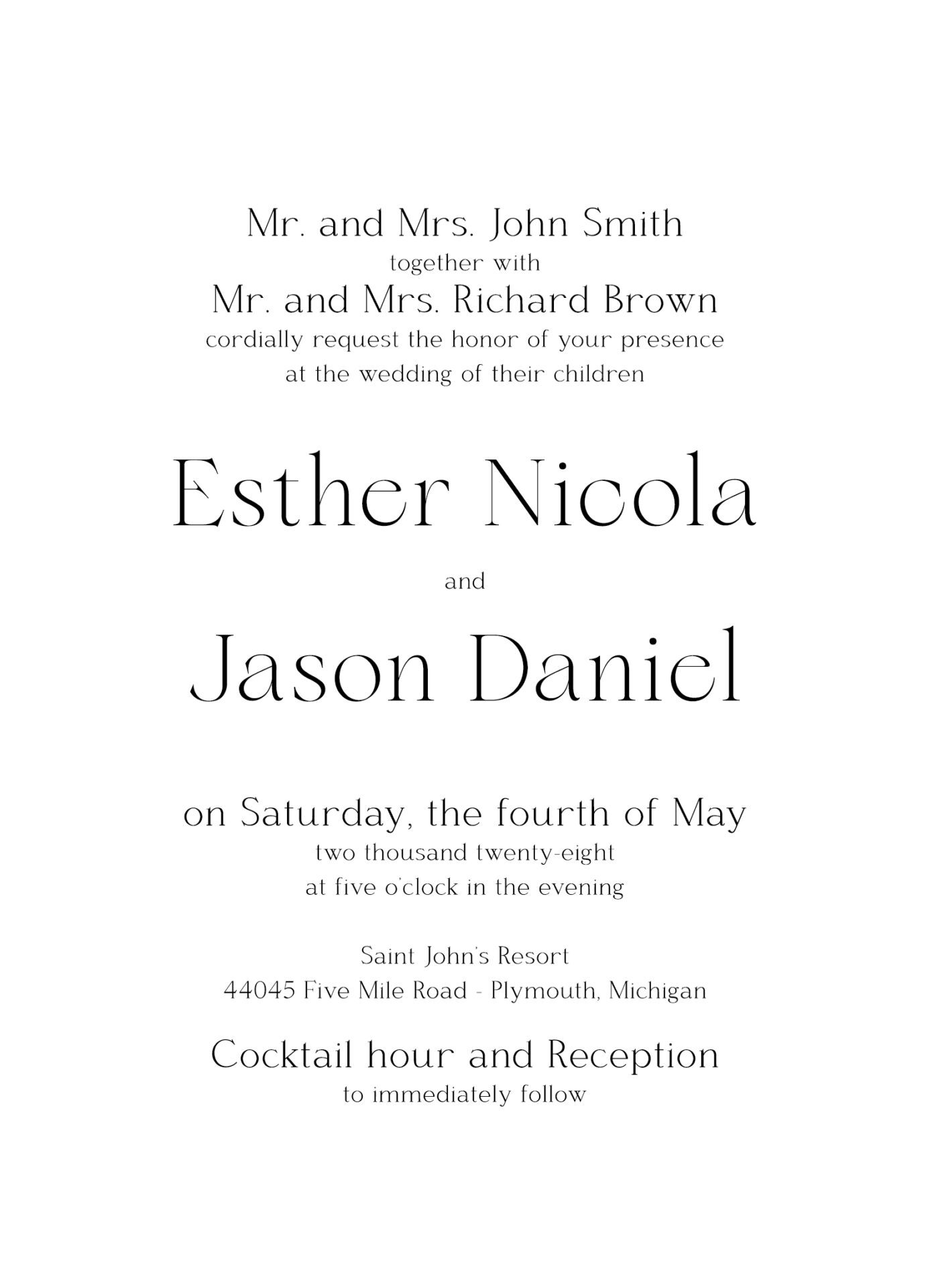
Modern Minimalist Wedding Invitation Layout ideas
For those drawn to simplicity and clean lines, a minimalist layout brings contemporary elegance to your invitations. Often featuring left-aligned or centered text with ample white space, this style creates a modern, refined look.
- Font Pairing: Sleek sans-serif fonts with subtle, modern lines
- Design Tip: Opt for a monochrome or neutral palette for added sophistication
Example Layout:
Whimsical Layered Invitation Layout
A layered layout with creative font pairings and playful design elements is ideal for a whimsical or bohemian wedding. Adding unique accents and textures, this style offers a relaxed yet elegant invitation feel.
- Font Pairing: A relaxed serif combined with a light script or handwritten font
- Design Tip: Use botanical or watercolor elements to add texture and personality
Example Layout:
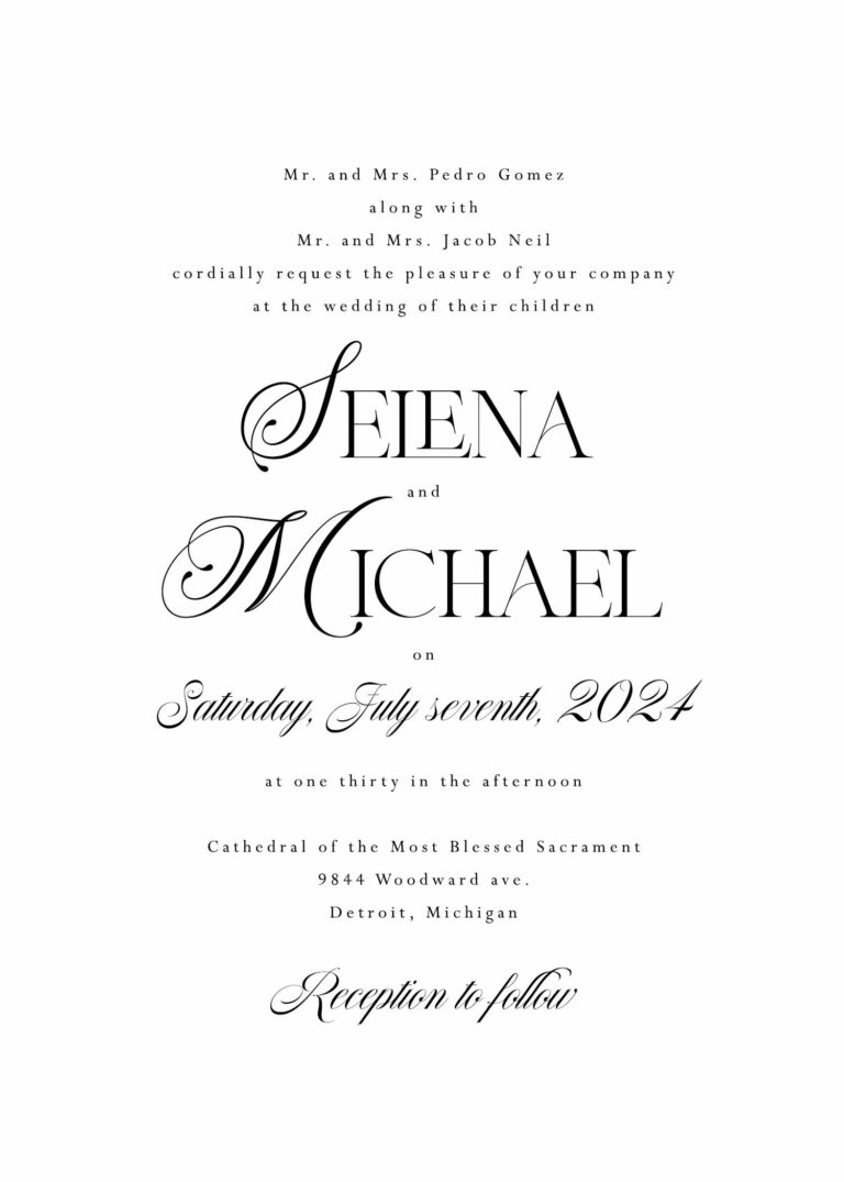
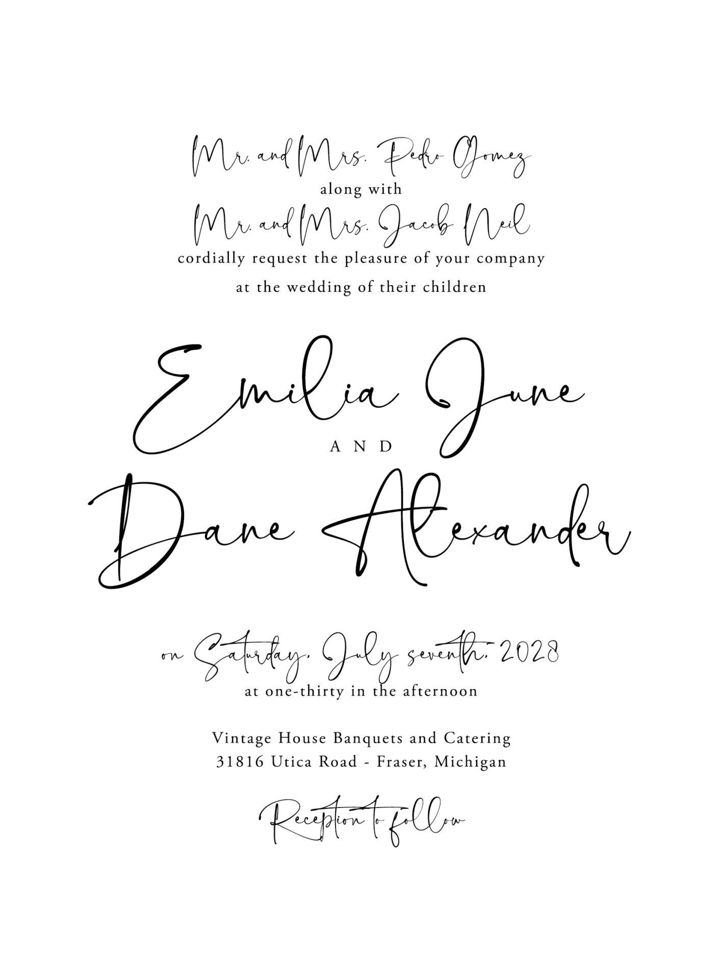
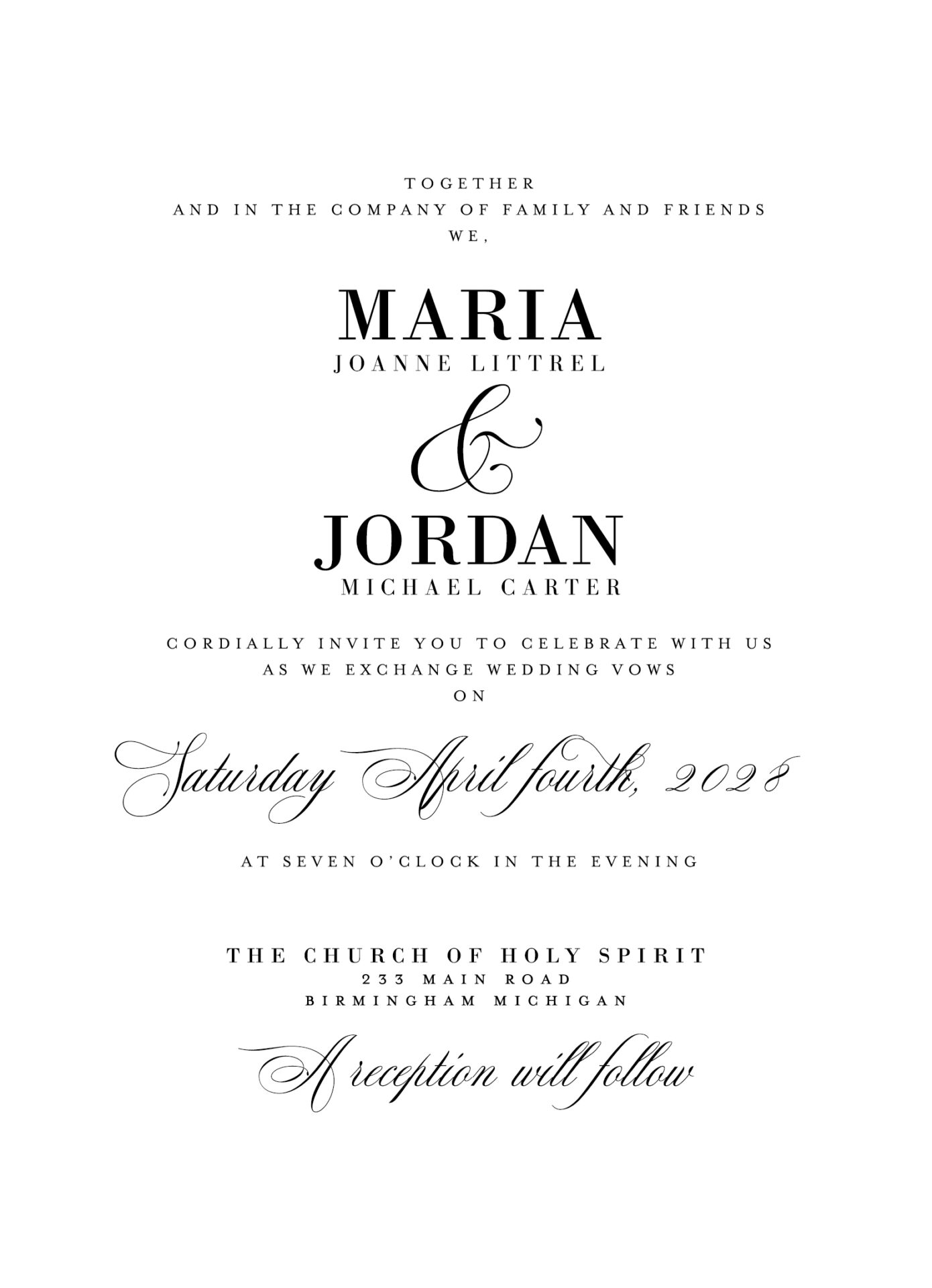
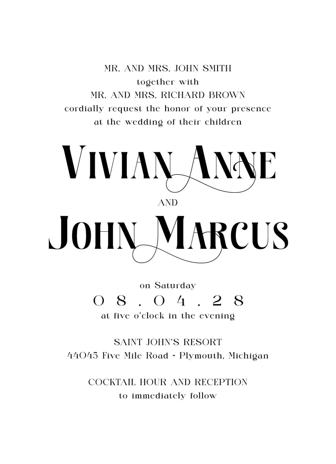
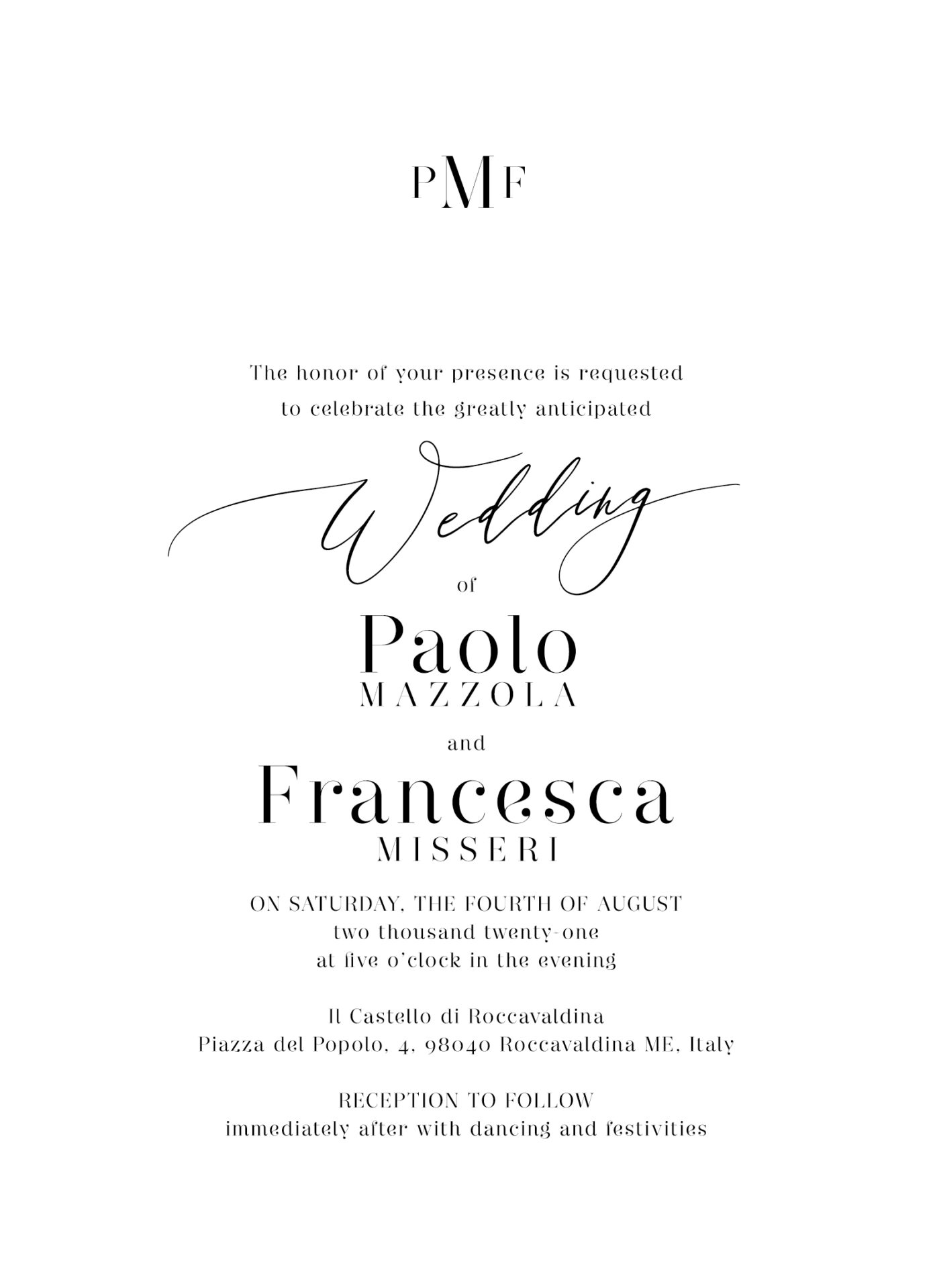
Bold Statement Layout for Invitations
A bold layout is designed to make an impression. By placing focus on oversized text, such as names or the wedding date, this style is perfect for couples who want their invitations to stand out. High-contrast fonts and colors work well here.
- Font Pairing: Large, bold serif or sans-serif for headlines with a clean font for details
- Design Tip: Use contrasting colors for impact and keep text concise for a powerful look
Example Layout:
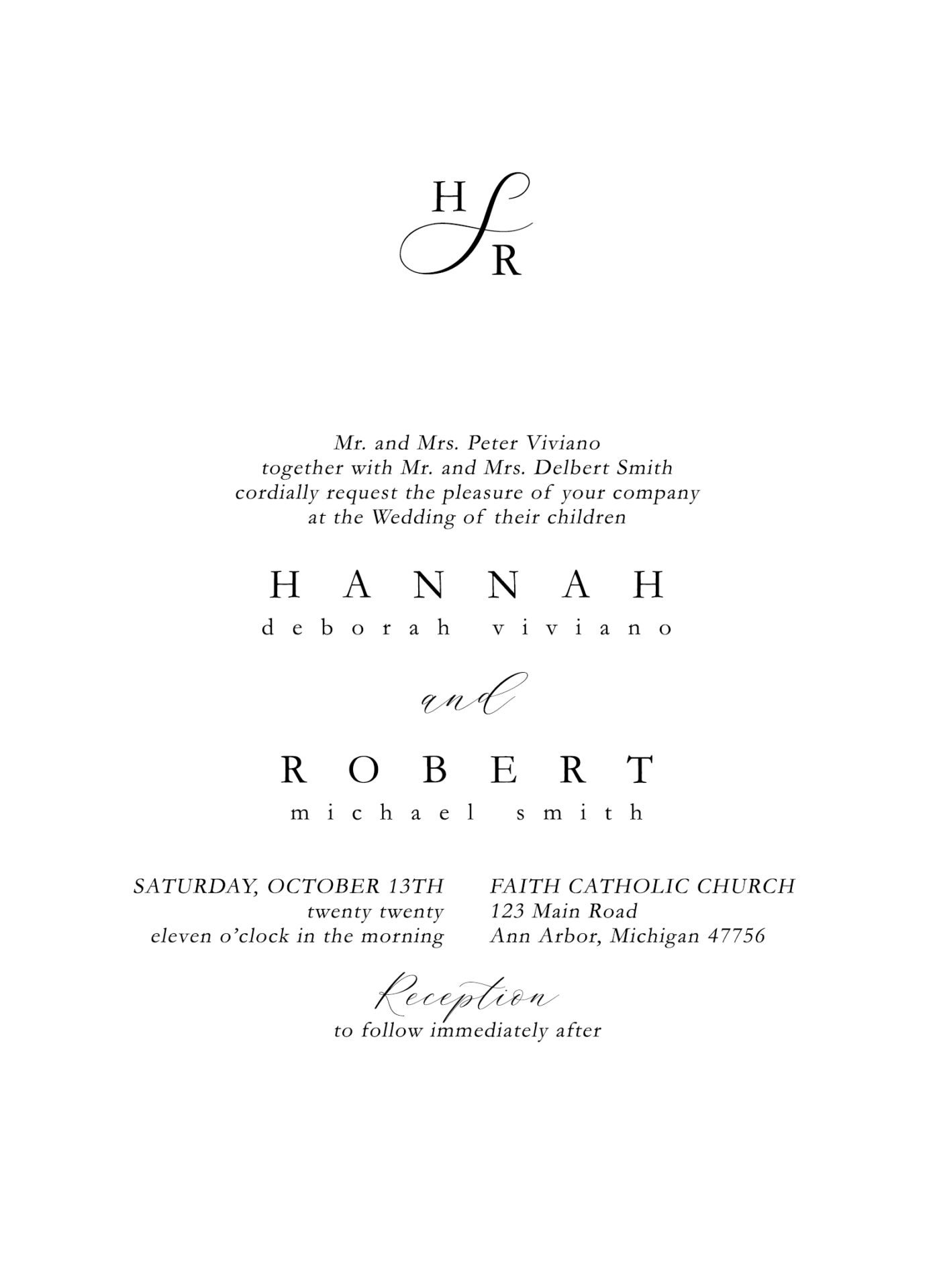
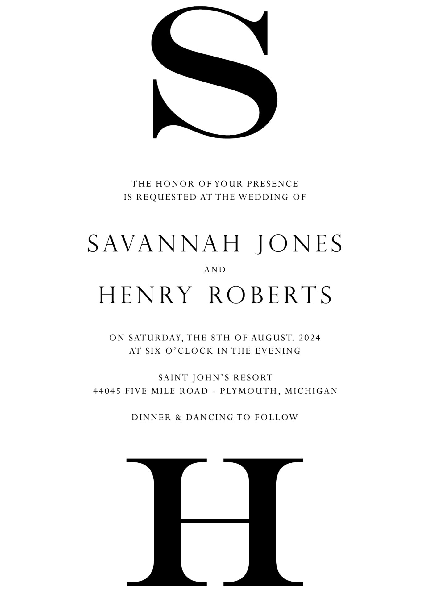
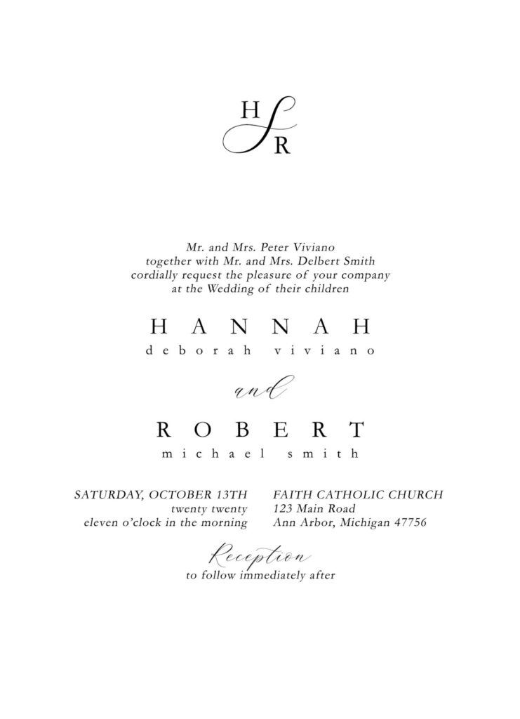
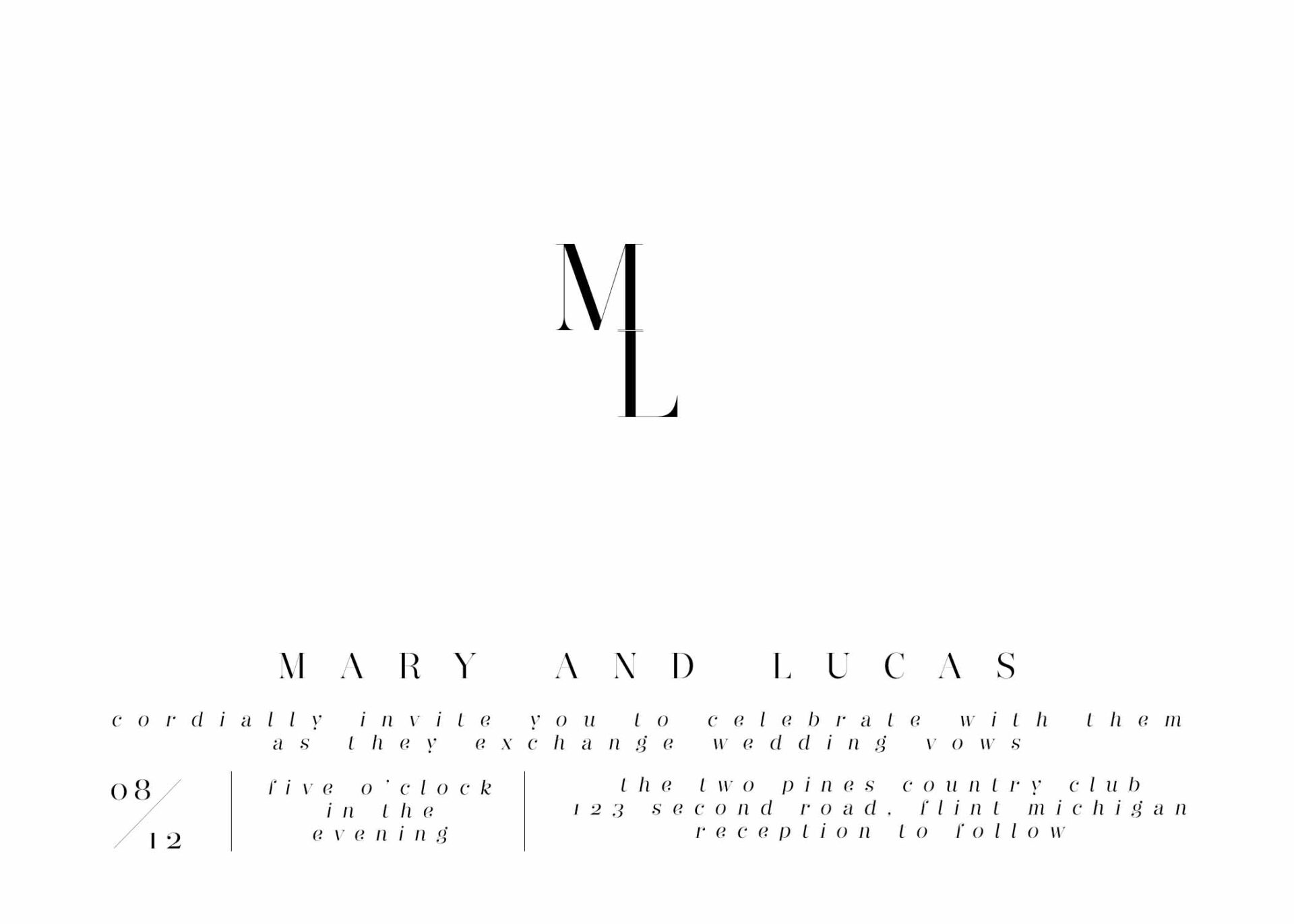
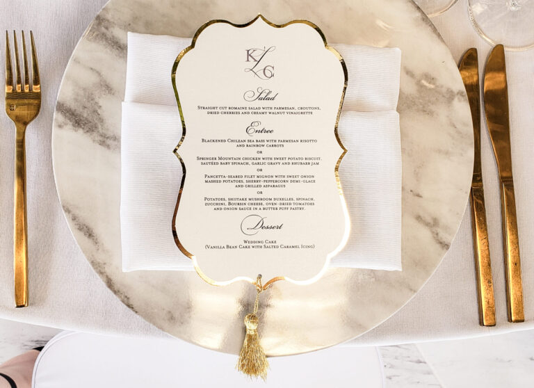
Monogram-Focused Invitation Layout
A monogram layout adds a personalized touch to wedding invitations, placing the couple’s initials as a focal point. This style works beautifully for both classic and contemporary weddings, making the monogram a stylish element.
- Font Pairing: Elegant serif for the monogram with clean, modern text
- Design Tip: Consider foil or embossing for a luxurious effect on the monogram
Example Layout:
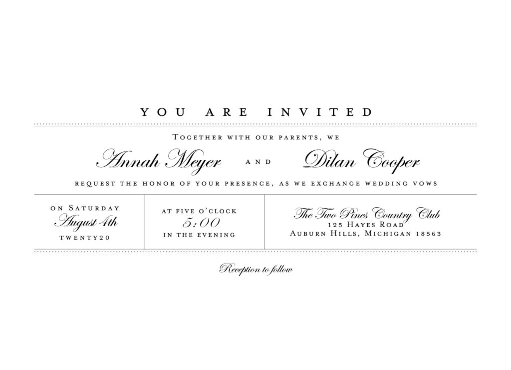
Horizontal Landscape Layout for Invitations
A horizontal layout offers a unique approach, especially suited for destination or outdoor weddings. This layout provides extra space for design elements like illustrations or a location map, adding a personal touch to your invitations.
- Font Pairing: Combine a clean serif with a handwritten font for a romantic look
- Design Tip: Include landscape artwork or watercolor accents to enhance the theme
Example Layout:
Choosing the Perfect Wedding Invitation Layout
Selecting your wedding invitation layout is a key step in defining the look and feel of your special day. Whether you prefer a classic, modern, or unique design, each layout style brings its own charm and elegance. Start by considering your wedding theme and color palette, then explore different fonts and layouts to find the design that feels just right. For more inspiration, view our layout and font pairing gallery on our Layout & Font Guide page. We’re excited to help you create a beautiful, personalized wedding invitation.

