
Color and typography can completely change the personality of a wedding invitation. The same layout can feel romantic, formal, modern, understated or expressive simply by changing the typefaces, ink colors and accents used throughout the suite. You do not need to have every detail of your wedding finalized before making these choices. We can begin with the atmosphere you are creating, the setting, a meaningful color or an invitation design that already feels close. From there, we will help you create a visual direction that feels personal and cohesive without requiring every element to match exactly.
Below, you can explore the font styles, core ink colors, accent shades and envelope colors available for our Curated invitation suites. These selections are intended to make customization easier, not to limit it. If your project calls for a particular color, custom artwork or a more extensive design change, we can discuss additional options during the quoting and design process.
Begin With the Feeling of Your Wedding
Before selecting an individual font or color, consider how you want the invitation to feel when your guests first see it.
A formal celebration may call for balanced spacing, refined serif typography and a restrained palette. A garden wedding may feel more natural with soft color, organic artwork and an expressive script. A modern wedding might use clean typography, strong contrast and an unexpected envelope color. Your venue, season, clothing, florals and cultural traditions can all offer direction, but the invitation does not need to reproduce every detail of the day.
Try beginning with three words that describe your wedding. For example:
- Romantic, soft and botanical
- Formal, timeless and architectural
- Modern, minimal and editorial
- Colorful, joyful and expressive
- Old-world, intimate and textural
- Coastal, relaxed and refined
Those words give us a clearer design direction than a long collection of unrelated inspiration images.
Wedding Invitation Fonts and Typography
Typography establishes the voice of an invitation. A flowing script can add romance and movement. A traditional serif can feel formal and timeless. A clean sans serif introduces a modern quality, while a character-filled display typeface can make a design feel editorial or distinctive. Most invitation designs use one expressive typeface for names or important details and a more readable companion font for the remaining wording. The goal is not to use as many fonts as possible. It is to create hierarchy, personality and clarity so that the couple’s names stand out while the date, location and supporting information remain easy to read.
Our font examples are shown in complete pairings rather than as isolated alphabets. This allows you to see how names, headings and smaller wording work together in an actual invitation layout. Font pairings may be adjusted to suit the design, wording and level of customization selected.
How Different Font Styles Affect the Design
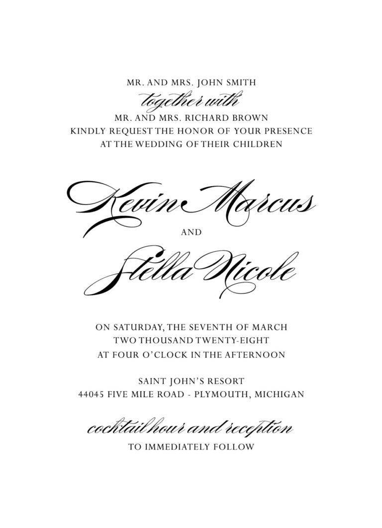


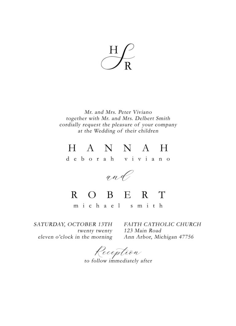


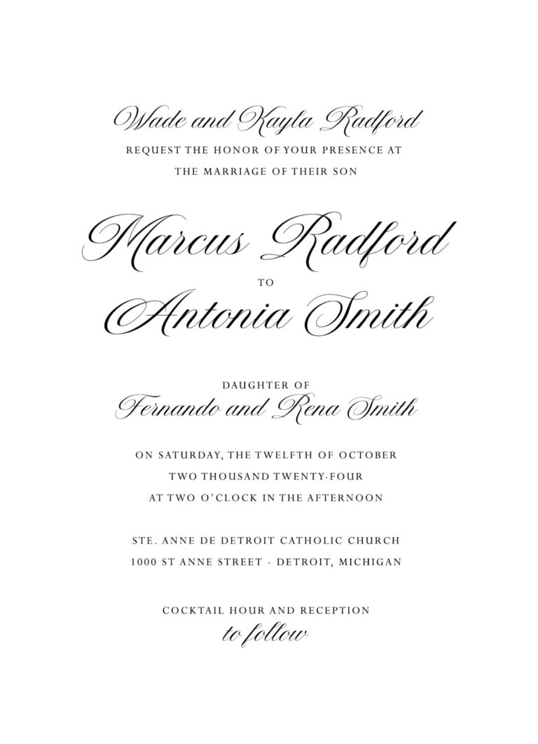
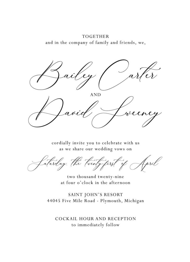
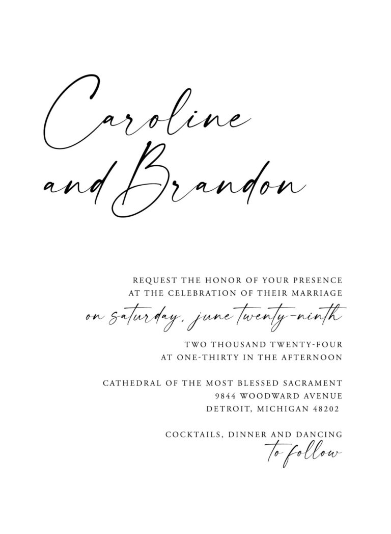


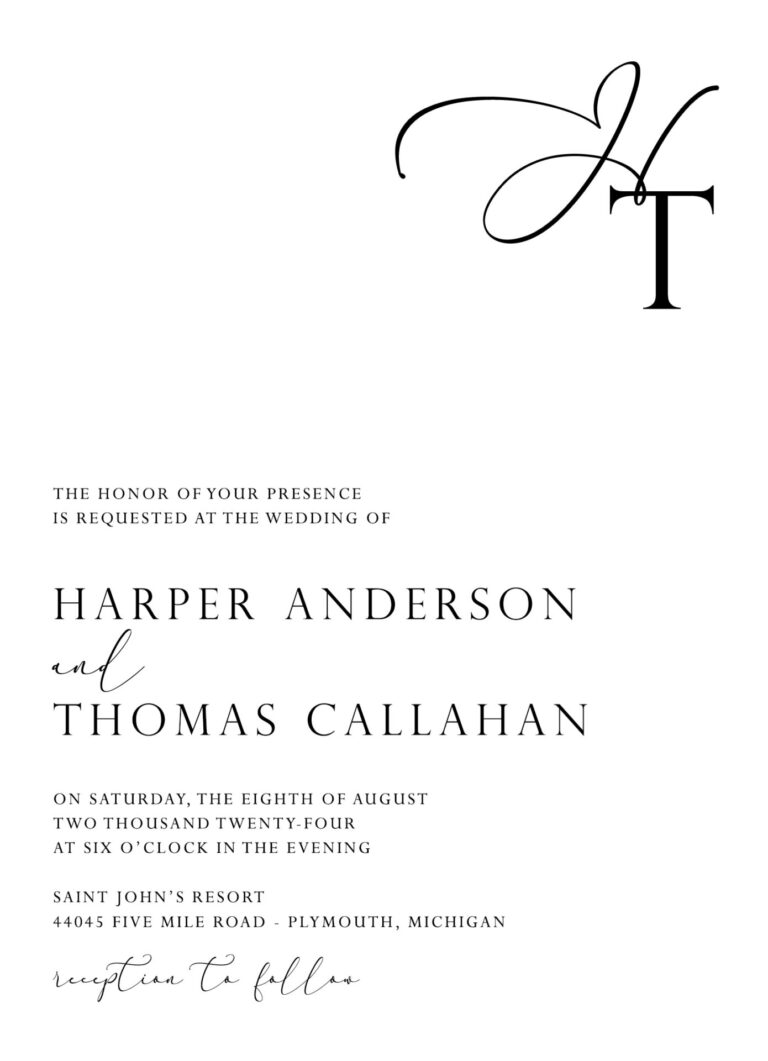
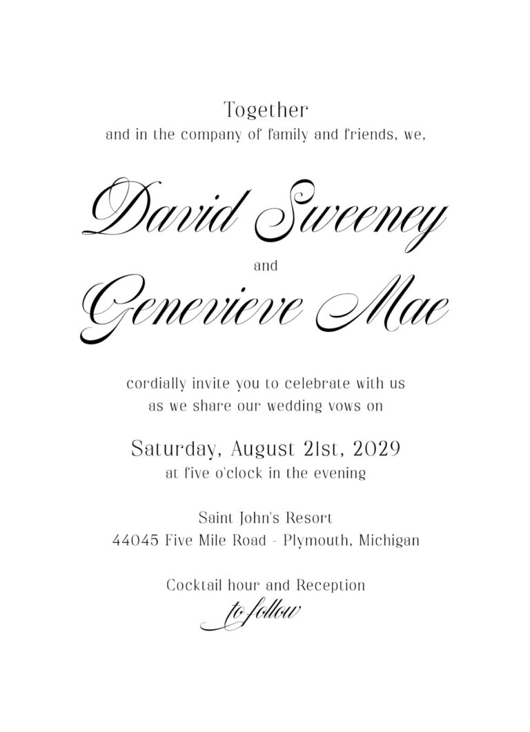


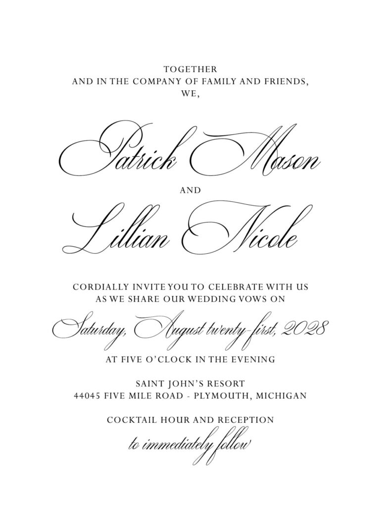
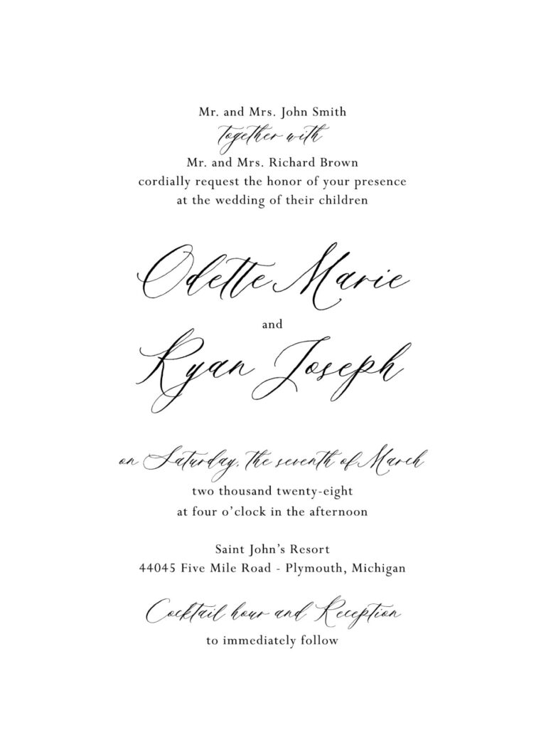


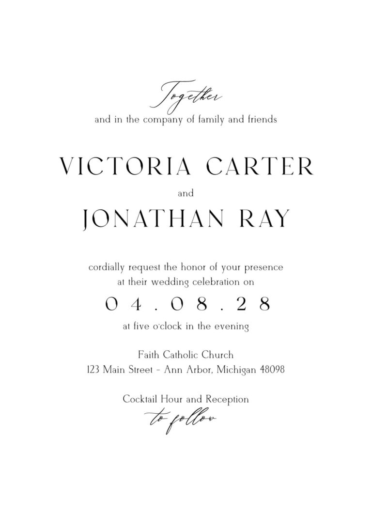

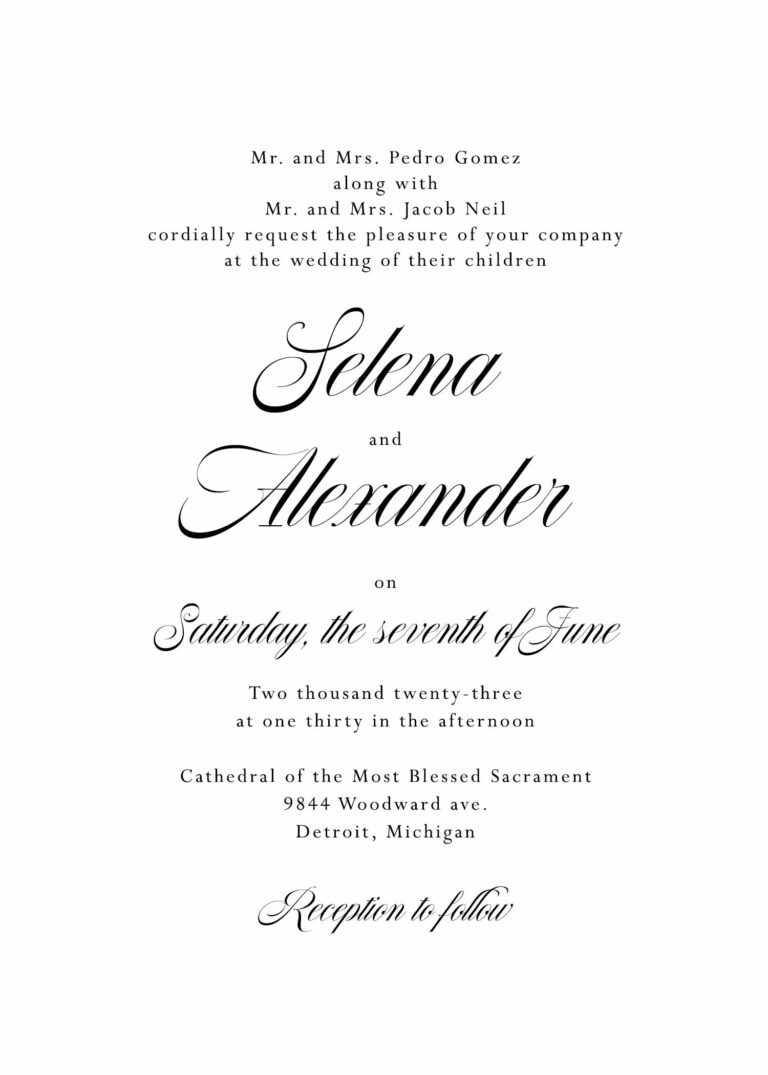

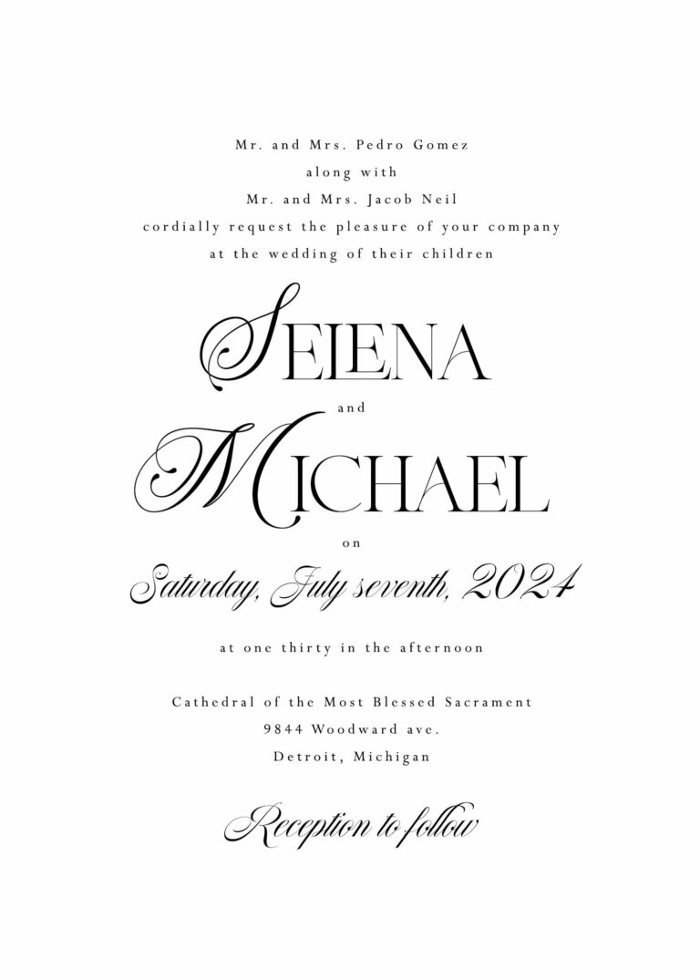

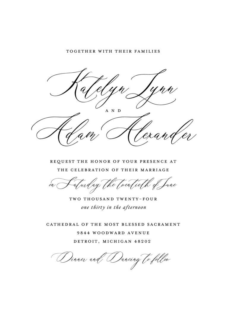
- Classic serif fonts feel polished, traditional and architectural.
- Modern serif fonts create a more editorial or fashion-inspired appearance.
- Script and calligraphy fonts add softness, movement and personality.
- Sans serif fonts feel clean, contemporary and understated.
- Small caps and spaced lettering can create a formal, structured presentation.
digital ink color
The main ink color carries most of the invitation wording, so it must be both beautiful and readable. Our core ink colors have been selected to provide enough depth for names, dates and smaller text while offering alternatives to standard black. Warm brown, softened charcoal and deep taupe can create a gentler neutral. Navy, forest and muted blue-green tones introduce color while remaining refined. Deeper rose, terracotta and wine tones can add warmth and personality without overwhelming the design. The ink color does not have to match the envelope, bridesmaid dresses or flowers exactly. It should belong to the same visual world. Often, a slightly softened or deepened version of a wedding color prints more clearly and feels more sophisticated on paper.
- Soft Charcoal
- Moonstone Slate
- Amethyst Smoke
- Burgundy Fig
- Desert Clay
- Terracotta Kiss
- Rose Nude Tint
- Apricot Veil
- Honeyed Oat
- Dove Velvet
- Olive Drabette
- Sage Ribbon
- Eucalyptus Tea
- Cedar Forest
- Nocturne Green
- Deep Teal
- Lakehouse Blue
- Dusty Sky
- Bluebell Slate
- Truffle Taupe
accents color
Accent colors are used in smaller, more intentional amounts. They may appear in the couple’s names, a monogram, border, venue illustration, floral artwork, backing layer or other decorative element. A soft accent can introduce a wedding color without asking it to carry every line of text. A deeper accent can create contrast and help a crest or architectural illustration stand out. Some designs use one ink color throughout, while others combine a readable core color with one or two complementary accents. The number of colors available may depend on the printing process. Digital printing accommodates full-color artwork and multiple shades more easily. Letterpress and foil printing are priced and produced by color or impression, so a restrained palette is often more practical and visually effective.
- Porcelain Mist
- Champagne Pearl
- Petal Blush
- Mauve Veil
- Sea-Glass Blue
- Sage Haze
- Latte Mousse
- Pale Citrine
- French Gray
- Silver Mist
envelopes colors
The mailing envelope is the first part of the invitation your guests will see. It can quietly continue the palette or introduce contrast before the suite is opened. A white, ivory or soft neutral envelope creates a classic presentation and works with nearly any invitation. Blush, mist, pale blue and muted green can add color gently. Navy, burgundy, forest, black and other deeper tones create a stronger first impression and may be paired with white or metallic addressing for visibility. Your envelope does not need to match the invitation paper exactly. It may coordinate with the typography, repeat an accent color or provide a deliberate contrast. When selecting a darker envelope, we will also consider the addressing method, return address, postage and mailing requirements.
- Wedding White
- Wedding Cream
- Cool Grey
- Pale Grey
- Chardonnay
- Timberwolf
- Powder Pink
- Cipria
- Lilac
- Cool Blue
- Eucalyptus
- Stone
- Rose Nude
- Terracotta
- Spice Nude
- Steel Blue
- Mid Green
- Forest Green
- Burgundy
- Amethyst
- Navy Blue
- Dark Teal
- Racing Green
- Ebony
- Crystal Shimmer
- Opal Shimmer
- Coral Shimmer
- Sand Shimmer
- Silver Shimmer
- Gold Shimmer
Custom Artwork and Meaningful Details
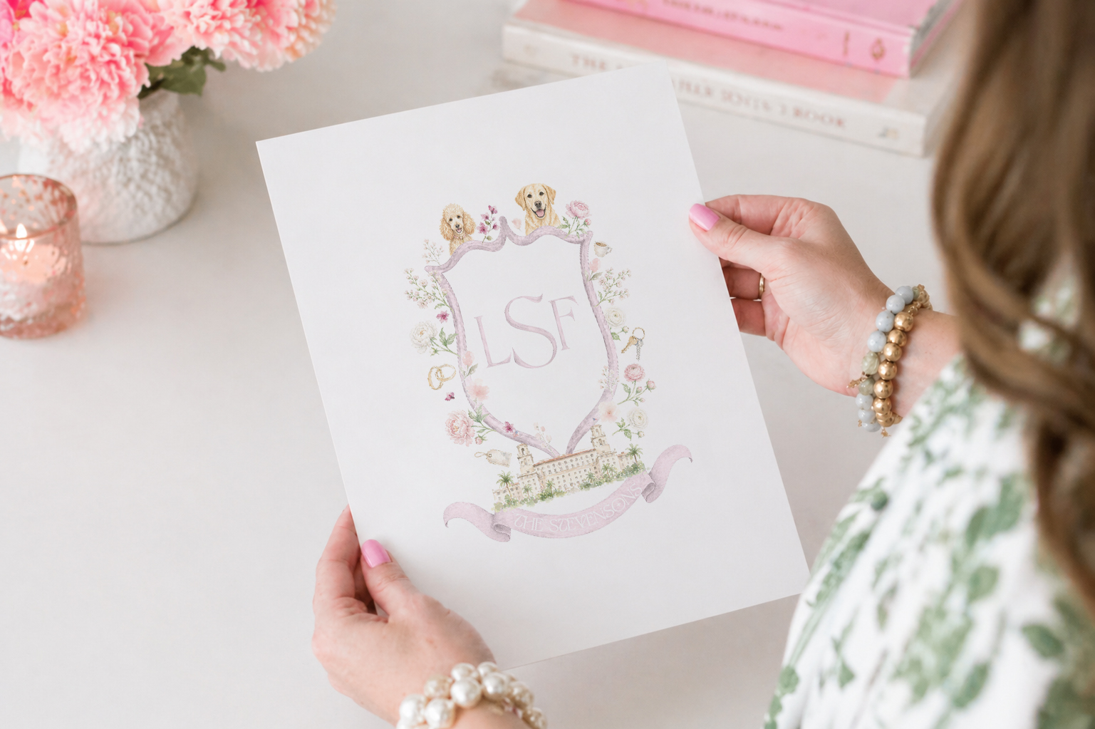
Color and typography establish the overall direction, but artwork is often what makes an invitation feel personally connected to the couple and the setting. Artwork can be incorporated into a Curated invitation when the existing structure provides the right starting point, or it can become the foundation of a more extensively customized design.
Crests and Monograms
A monogram is a letter-based mark created from the couple’s initials. A crest is usually a fuller composition that may combine initials with florals, architectural details, pets, cultural symbols or other meaningful imagery. Either can be carried through the invitation suite and later repeated on menus, programs, cocktail napkins, signage or other wedding-day details.

venue illustration
A custom venue illustration can feature a church, estate, hotel, villa, landscape or recognizable architectural detail. It may appear prominently on the invitation, as a subtle line drawing, on an envelope liner or as part of a larger crest.

Florals, Motifs and Personal Artwork
Botanical artwork, destination references, meaningful symbols and custom patterns can help connect the stationery to the location or story of the wedding. We can adapt existing artwork when appropriate or develop something more original for projects requiring a higher level of customization.